
The hottest graphic tee in your closet is usually the one most likely to crack. That's the part people miss, because the shirt that looks loudest on day one is often the one that gives up first after a few hot washes, while a heavyweight cotton blank or an embroidered crest keeps looking intentional long after the hype fades. The question isn't whether a tee has art on it, it's whether the fabric, decoration method, and fit can survive real wear.
Table of Contents
- What Makes a Graphic Tee a Graphic Tee
- Print Methods Worth Knowing Before You Buy
- Fabric Weight and Feel for Streetwear
- Why Embroidery Wins for Crest Graphics
- How to Style Graphic Tees Without Looking Generic
- Caring for Prints So They Do Not Crack or Fade
- Smarter Buys and the NYC Streetwear Mindset
What Makes a Graphic Tee a Graphic Tee
A graphic tee isn't just a cotton shirt with ink slapped on the front. It became a distinct fashion category in the early 1960s, when multicolor screen-printing machines made detailed designs scalable and turned the T-shirt into a visible canvas for self-expression and branding, not just a basic undergarment. That history matters because it explains why the category still works today. The shirt carries a message, a logo, a joke, a reference, or a crest, and the clothes around it either support that message or kill it.
Start with the base, then judge the graphic
A legit graphic tee usually has three things going for it. First, a blank base that feels like streetwear, not sleepwear. Second, a design placed where the eye lands fast, usually the chest or back. Third, a cut that sits like an outfit choice, not a gym leftover.
The best tees read as a silhouette first and artwork second. That's why heavyweight cotton matters so much in streetwear, and why a cheap, thin blank makes even a strong print feel disposable. Industry data shows the broader global T-shirt market is now measured in the tens of billions, with one current industry summary putting it at $30.68 billion in 2026 and noting that the graphic design shirt segment held the largest revenue share in custom T-shirt printing in 2024. That same market summary makes the point clearly, graphics aren't a side note anymore, they're a core commercial driver.
Culture decides what feels real
Band tees, skate graphics, bootlegs, bodega-style logo drops, and New York crest pieces all shaped the category because they made the shirt feel local and lived-in. That's the lane DM-FlexWear sits in with its NY Crown Crest pieces. A tee like the NY Crown Crest Heavyweight Unisex Tee works because it combines graphic identity with a structure that feels deliberate.
Practical rule: if the tee wouldn't look good with nothing else around it, it's not carrying enough weight to justify the print.
That's the lens for everything else here. You're not buying a picture on cotton. You're buying a piece of streetwear that should still make sense after the first wash, the tenth wear, and the season when the trend cools off.
Print Methods Worth Knowing Before You Buy
The decoration method decides how a tee ages. Two shirts can look similar on a product page and behave completely differently in real life. One can stay crisp for years, another can start to feel tired after a few spins in the dryer.
The four methods that matter
Plastisol screen print is the classic streetwear move. It lays a thicker layer of ink on top of the fabric, which gives you bold color, strong opacity, and good durability. The trade-off is feel. It can sit rubbery, and over time it's the kind of print that cracks at flex points if the shirt gets abused.
Water-based and discharge ink sink deeper into the cotton, which gives a softer hand-feel and a faded, vintage finish. That's why they work for washed-out, retro graphics. They're less ideal if you want a tee that looks freshly sharp for a long time.
DTG, or direct-to-garment, gives you the most detail. It's the right choice for photo-style art, gradients, and intricate drawings because it can keep the print lightweight. Cheap DTG can peel or wear poorly, though, so the execution has to be solid.
Heat transfer vinyl is the fast and inexpensive option. It's useful for simple names, numbers, and short-run novelty jobs. It also tends to be the shortest-lived of the group, which makes it the first method I'd skip if I'm paying for a shirt I plan to keep.
Streetwear verdict: use screen print for bold graphics, DTG for detailed art, and embroidery when you want a crest to outlive the trend.
The comparison that actually helps you buy smarter
| Print Method | Hand-Feel | Durability | Best For | Streetwear Verdict |
|---|---|---|---|---|
| Plastisol screen print | Thicker, slightly rubbery | Strong at first, can crack over time | Bold logos, slogans, club-style graphics | Good for expressive drops |
| Water-based or discharge | Soft, broken-in | Good, but less aggressive than thicker prints | Vintage looks, faded art | Strong if you want a worn-in vibe |
| DTG | Light and smooth | Depends on execution, can peel if cheap | Photo detail, gradients, complex art | Fine for detail-heavy designs |
| Heat transfer vinyl | Smooth but sits on top | Shortest lifespan | Names, numbers, quick custom jobs | Skip it for long-term wear |
If you want a shirt to act like fashion, not merch, prioritize the method that matches the design language. Loud slogans can take screen print. Fine-detail art needs DTG. Clean crest logos should probably just be embroidered.
Fabric Weight and Feel for Streetwear
Fabric weight is the first thing I check because it decides how the tee sits before the graphic even matters. A great print on a flimsy blank still reads cheap. A simple logo on a strong shirt can look expensive right away.
GSM changes the whole read
GSM means grams per square meter. It tells you how dense the fabric is, and in plain English it signals whether the shirt feels featherlight, everyday, or properly built. A tee in the 140 to 160 GSM range usually wears light and drapey. A 170 to 200 GSM shirt lands in that everyday middle zone. A 220 to 280 GSM blank starts reading as heavyweight, boxy, and streetwear-ready.
That heavier build matters because it holds shape better. It sits off the body instead of clinging, and that gives the graphic room to breathe. Lightweight tees can still work for summer, but they often make even good prints look temporary.
Cotton choice changes print quality too
Cotton isn't just cotton. Ringspun combed cotton feels smoother and gives printers a cleaner surface, while open-end cotton is rougher and cheaper. Fabric guidance notes that natural-fiber cotton surfaces generally accept screen printing and direct-to-garment ink better than many synthetic-heavy blends because the fibers and texture improve ink wetting and mechanical anchoring. Heavier fabrics in the roughly 6 oz+ range also tend to be more durable, while lower-GSM tees are lighter but more vulnerable to abrasion and distortion over repeated wear and washing. That fabric guidance lines up with what streetwear buyers learn fast.
A heavyweight blank is the baseline if you want the shirt to feel credible in an NYC wardrobe. That's why pieces built like the NY Crown Crest Heavyweight Unisex Tee make more sense than soft, thin fashion tees when you care about drape and longevity.
Buy this, skip that: if the shirt feels soft but collapses in your hands, it's probably not worth the print.
Choose heavier cotton first and artwork second if you want a shirt that feels like a real garment. If you want a throwaway trend piece, the thin blank will do. Don't confuse the two.
Why Embroidery Wins for Crest Graphics
Embroidery wins when the graphic is supposed to feel like a badge. A crest, monogram, school-style mark, or NY-inspired emblem belongs in thread, not ink, because stitched detail sits into the garment and keeps its shape under real wear. It also gives the tee a richer surface that flat print cannot copy.
Thread survives what ink struggles with
Stitched decoration resists wear because the artwork is locked into the fabric structure instead of sitting on top of it. Dense satin-stitch crests, chain-stitch lettering, and twill-backed patches keep their edges better through repeated washing. Screen print eventually takes stress at folds and flex points like the chest and hem.
The payoff is cost per wear. Embroidery asks for more money up front, but if you plan to wear the piece for years instead of weeks, it earns that spend back. The surface also catches light in a way print cannot, so the logo looks more dimensional and less disposable.
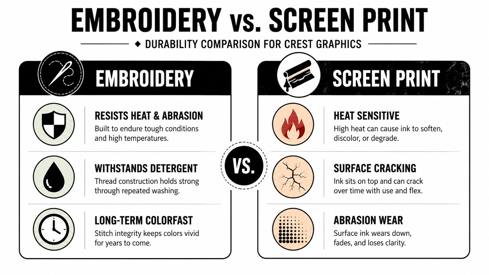
NYC streetwear makes that choice even clearer. New York labels and NYFW-adjacent brands use crest embroidery to signal craft, not novelty. The same logic shows up in premium embroidered crewnecks and hoodies from DM-FlexWear's embroidered crewneck sweatshirt line. The shirt does not need to scream. It just needs to look like it belongs in the city's streetwear ecosystem.
Know the limits before you pay extra
Embroidery is not right for every graphic. Tiny text gets harder to read when the thread count is limited. Very lightweight knits can pucker under dense stitching. Oversized photoreal graphics also lose impact in thread, because embroidery is built for shape and texture, not full-image realism.
If the design is a crest, logo, or text mark, go embroidered. If it is a huge illustrated scene, print still wins. Skip the embroidery for art that needs a flat field.
How to Style Graphic Tees Without Looking Generic
The shirt isn't the issue, the outfit is. If the tee is loud and everything else is lazy, the whole look reads sloppy. If the tee is simple and the rest of the fit has shape, the shirt suddenly looks expensive.
Build the outfit around contrast
A strong formula starts with a mid-weight or heavyweight graphic tee and adds a piece that changes the mood. Try a relaxed boxy tee half-tucked into pleated trousers with loafers. That gives you structure against the casual shirt and stops the outfit from falling into weekend errand territory.
Another clean move is layering. A long sleeve under a short sleeve print gives visible cuff contrast and adds depth without trying too hard. A tee worn open over a plain tee also works when you want tonal layering and don't want the graphic to fight the rest of the fit.
Keep one loud thing, then make everything else support it.
Get the proportions right
The tee should sit like it was chosen on purpose. Shoulder seams should hit at the bone. Sleeves should land around two inches above the elbow if you want a stacked look. The hem should cover the belt but not drag over the seat.
Color matters too. Match the print's secondary color to one thing only, like a cap, jacket lining, or sock stripe. That keeps the look connected without turning it into a costume. For family or couple fits, coordinate the color family instead of duplicating the exact same graphic. DM-FlexWear's family matching t-shirts fit that approach because the outfit feels linked without looking copied.
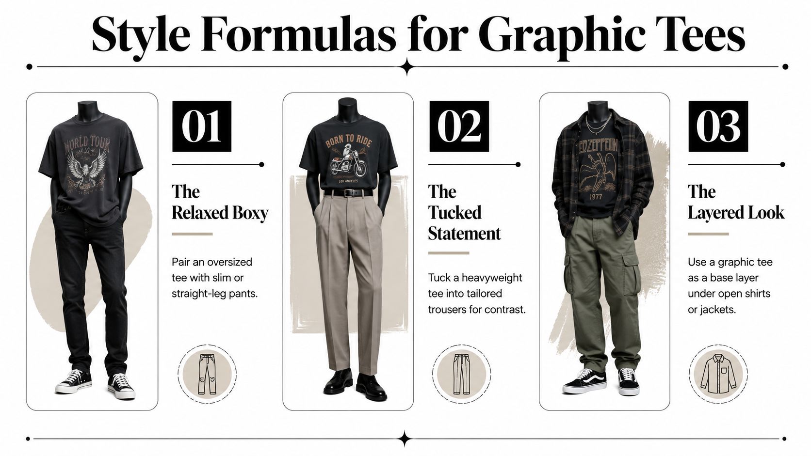
The easiest rule is this. Let the shirt be the statement, then use pants, layering, and accessories to sharpen it. That's how graphic tees move from casual to considered.
Caring for Prints So They Do Not Crack or Fade
Prints usually fail because of heat, not because the shirt was doomed from the start. When plastisol and water-based inks cure properly, they bond into the cotton surface, but hot wash cycles, hot dryer heat, and direct ironing slowly break that bond. Cracking often starts where the shirt bends most, especially around fold lines and stress points.
The wash routine that protects graphics
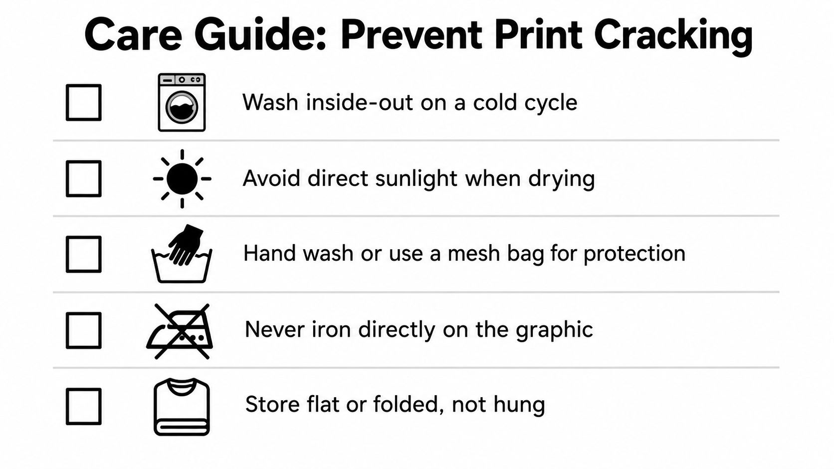
Turn the tee inside out before washing. Use cold water, a gentle cycle, and mild detergent. Skip chlorine bleach and fabric softener, because softeners coat fibers and can dull pigment while also weakening the bond between the print and the fabric.
Air-drying is the safest move. If you need to use a dryer, keep it low and short, then finish by hanging it until fully dry. Cold water below 30°C can improve ink adhesion longevity by about 40% versus warm washes. That care guidance backs up what many people notice after a few ruined tees.
Store it like you want it to last
Fold the shirt instead of hanging it if you care about keeping the neck from stretching out. Keep it out of direct sunlight because UV breaks down both dye and ink over time. If you need to iron it, press from the reverse side with a cloth barrier or use steam from a distance.
If a print is already starting to crack, a gentle re-press with parchment can smooth the edges temporarily. It will not make the shirt new again, but it can buy you more wear. That matters if the tee still fits the rest of your wardrobe and you want to extend its life without pretending it is perfect.
Smarter Buys and the NYC Streetwear Mindset
NYC streetwear is a quality test, not just a location tag. The shirt needs to feel deliberate, hold up under real wear, and sit in a rotation of hard-working staples instead of novelty buys. Heavy cotton, sharp graphics, and solid construction matter more than hype.
The rules I'd follow
- Choose heavyweight first. If the blank feels thin, the tee will usually age badly, no matter how strong the artwork looks.
- Respect the decoration method. Screen print works for loud, expressive graphics. Embroidery makes more sense for crest-style designs that need texture and staying power.
- Check the seams and hem. A good graphic on a sloppy body still reads cheap.
- Ask the relevance question. If the design feels dated in two years, skip paying like it is timeless.
Bigger graphics do not automatically make a better shirt. Soft, lightweight cotton is not always premium either, sometimes it is just thin. If the tee is meant to be a real part of your wardrobe, judge it by cost per wear and construction, not by the first touch.
DM-FlexWear fits that logic because its catalog centers on the NY Crown Crest theme across tees, hoodies, and crewnecks, with embroidered options for buyers who want texture and a more durable finish. If you care about graphic tees that look sharp, wear well, and keep their shape in a New York streetwear wardrobe, go look at DM-FlexWear.com. Pick the blank and decoration method that match how you dress, not how the shirt looks on the hanger.