

Buying graphic hoodies backward is common. People fall for the color, the logo, or the hype, then discover the artwork was applied to a garment that can't survive their laundry routine. In streetwear, decoration method comes before design. A great graphic on weak ink is a short-term purchase, while a quieter embroidered crest can become the piece you reach for every week.
That method-first mindset also makes styling easier. A large print, a raised puff logo, and a stitched chest mark each create a different visual weight, so they shouldn't be worn with the same silhouette or washed the same way. From a Lower East Side layer to an NYFW-adjacent tonal fit, the right graphic hoodie is part artwork, part textile engineering, and part daily uniform.
Table of Contents
- Why Graphic Hoodies Are a Decoration Decision First
- Understanding Prints, Embroidery, and Hybrid Decoration
- Breaking Down the Main Print Methods for Streetwear
- Print Versus Embroidery and What Holds Up Over Time
- How to Style Graphic Hoodies Across Fits and Unisex Sizing
- NYC Outfit Pairings That Make the Graphic Hit Harder
- Care Routine That Keeps the Design Looking New
- Picking Graphics With Real Shelf Life in 2026
Why Graphic Hoodies Are a Decoration Decision First
The hoodie began as utility. In the 1930s, Champion Products, then known as the Knickerbocker Knitting Company, developed the first hooded sweatshirt in the United States for athletes and laborers working in cold conditions. The garment later moved into streetwear and youth culture by the 1970s, while graphic hoodies spread commercially during the 1990s as brands used logos, artwork, and identity-driven prints to turn a basic layer into a statement piece. The history of the hoodie explains why the category still works: it combines warmth, durability, and a visible surface for decoration.
That history matters at checkout. A hoodie isn't just a blank canvas. It's a high-contact garment that bends at the torso, rubs against bags, catches on jacket shells, and goes through repeated washing. The decoration has to match that abuse.
Streetwear rule: Choose how you want the hoodie to age before choosing what you want it to say.
Embroidery is the safer call for a premium crest, small chest logo, or family staple that'll be worn repeatedly. The thread sits inside the fabric rather than forming a surface film, so it won't crack or peel in the same way a print can. Prints remain the better tool for oversized artwork, gradients, illustrated scenes, and detailed back panels, but they demand more care and better process control.
The market is large enough to support both directions. One independent estimate values the global hoodies market at USD 19.48 billion in 2025, with a projection of USD 20.44 billion in 2026 and USD 31.43 billion by 2035, implying a 4.9% compound annual growth rate from 2026 to 2035. Global hoodies market estimates point to a category with sustained demand, not a passing niche.
My recommendation is blunt: pick the decoration first, then judge the artwork through that technical lens. If the design only works as a huge print, buy it as a print and accept the care requirements. If the hoodie needs to function as an everyday uniform, choose stitch-based decoration or a hybrid build.
Understanding Prints, Embroidery, and Hybrid Decoration
Modern graphic hoodies fall into three useful decoration families. Printed graphics cover screen printing, direct-to-garment work, plastisol, and puff ink. Embroidered graphics include flat stitching, 3D puff embroidery, and chenille patches. Hybrid pieces combine methods, often pairing a printed back graphic with an embroidered front crest.
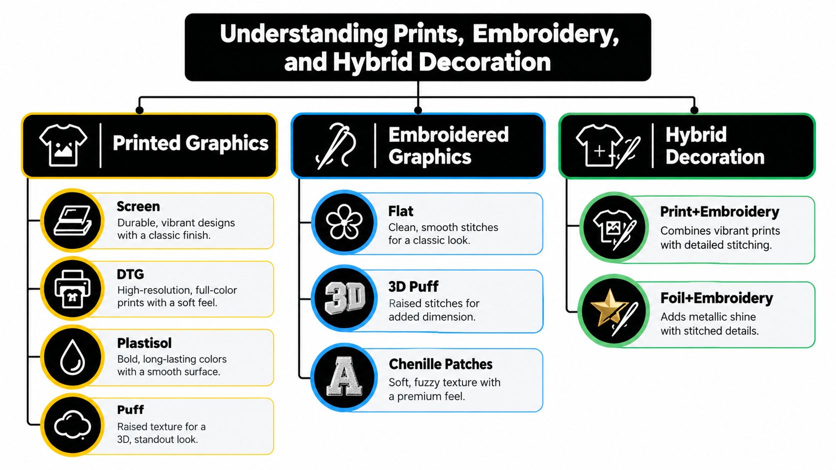
Think of the category as a scale of visual complexity and physical resilience.
Printed graphics
Print is the choice for large artwork and broad color control. Screen printing handles bold shapes and strong opacity. DTG handles intricate artwork without requiring a large production run. Plastisol gives graphics a dense, opaque surface, while puff ink adds a raised finish that turns a simple chest hit into a tactile statement.
Print sits on top of the fabric, so hand-feel matters. A thick print can feel rubbery, while a softer process can merge more naturally with the fleece. Large printed panels also expose more surface area to flexing, heat, and abrasion.
Embroidered graphics
Embroidery gives a hoodie texture and structure. Flat embroidery keeps logos crisp and restrained. 3D puff embroidery creates height for athletic or collegiate-inspired lettering. Chenille patches push the garment toward varsity and heritage territory.
Thread is mechanically anchored into the garment, which makes it more resistant to cracking and peeling than print-based decoration. The tradeoff is detail. Tiny gradients and photo-real illustrations don't translate cleanly into stitches, and poorly engineered backing can create stiffness or puckering.
Hybrid decoration
Hybrid builds are often the smartest premium option. A printed back can carry detailed art, while an embroidered chest mark gives the front of the hoodie a durable focal point. A patch or stitched crest can also break up an otherwise flat graphic.
For a deeper technical comparison, use this screen printing versus embroidery guide. The short version is simple: print gives you visual range, embroidery gives you physical staying power, and hybrid decoration lets each method do the job it handles best.
Breaking Down the Main Print Methods for Streetwear
Print quality depends on the process, the blank, the curing, and the care routine. Don't treat “screen printed” as a complete quality description. Two hoodies can use the same broad method and feel completely different.
Water-based and discharge screen printing
These methods suit heritage-inspired graphics and washed fleece. They can create a softer hand-feel because the ink integrates more naturally with the textile instead of sitting as a heavy surface layer. The drawback is that the result depends heavily on fabric composition and production control, especially when the design needs strong opacity.
Plastisol screen printing
Plastisol is the heavyweight streetwear workhorse. It delivers bold, opaque color and works especially well on dense fleece and large hype-drop graphics. The surface can feel heavier, and high heat or repeated abrasion can encourage cracking over time. It's a strong choice when impact matters more than a barely-there hand.
DTG printing
Direct-to-garment printing handles detailed illustrations, photo-like art, and smaller runs without the same setup demands as traditional screen printing. It's ideal for artist collaborations, one-off artwork, and designs that rely on tonal transitions. The finish usually feels softer than thick plastisol, but exposure to sunlight and aggressive washing can reduce visual intensity.
Puff ink
Puff ink expands to create a raised graphic. It's strongest on logo-led chest hits, collegiate lettering, and compact symbols where texture carries the design. It can look cheap when applied to a weak blank or pushed into an overcomplicated composition, so the garment's base and the graphic's scale need to work together.
| Print Method | Durability | Hand-Feel | Best Use | Watch Out For |
|---|---|---|---|---|
| Water-based or discharge screen print | Softens naturally with wear when properly applied | Soft and integrated | Heritage graphics and vintage-inspired artwork | Uneven opacity on unsuitable fabrics |
| Plastisol screen print | Strong, but vulnerable to heat, flexing, and abrasion | Dense and opaque | Heavyweight statement drops | Cracking after harsh washing |
| DTG | Suitable for regular wear with careful laundering | Soft to moderate | Detailed art and small-run collaborations | Fading from UV exposure and rough care |
| Puff ink | Durable enough for focused graphics, but raised areas need care | Raised and dimensional | Chest logos and bold lettering | Flattening, snagging, or overworked texture |
The durability comparison for screen printing gives a useful real-world benchmark: quality screen prints can typically survive about 50 to 100 or more wash cycles before noticeable cracking or fading. That doesn't make every print immortal. It means process quality and laundering decide whether the hoodie ages with character or looks neglected.
Print Versus Embroidery and What Holds Up Over Time
The print-versus-embroidery debate becomes clear when you match the method to the garment's expected abuse. A full-back illustration needs print because it can carry detail, gradients, and expansive composition. A left-chest logo on a daily uniform benefits from embroidery because the decoration has to tolerate repeated rubbing and laundering.
Quality screen prints can typically last about 50 to 100 or more wash cycles before noticeable cracking or fading, while embroidery is generally described as lasting the full life of the garment because the thread is anchored into the textile. Apparel embroidery durability guidance supports the core distinction. Embroidery can still fail when the backing, stitch density, or borders are poorly engineered, so “stitched” isn't a free pass.
| Factor | Embroidery | |
|---|---|---|
| Color range | Broad, including gradients and detailed artwork | More limited by thread colors and stitch structure |
| Surface | Flat, soft, dense, or raised depending on process | Textured and dimensional |
| Best placement | Full front, full back, and detailed panels | Chest crests, logos, patches, and compact marks |
| Main risk | Cracking, fading, and heat damage | Puckering, stiffness, or backing failure |
| Wear behavior | Ink can break down through flexing and abrasion | Thread resists fading but can snag or stress the base |
| Buying logic | Choose it for artwork complexity | Choose it for repeat wear and premium texture |
Independent textile research adds another useful layer. ASTM and ISO-style abrasion methods, including the Martindale test, measure wear through repeated rubbing, and substrate stability strongly affects performance. In a study of textile-embroidered structures, samples maintained good function after 30 wash cycles, while the embroidery showed no relevant physical damage after 55 abrasion cycles. The textile embroidery abrasion study makes the practical point clear: placement and base fabric matter as much as decoration size.
For an embroidered everyday staple, compare the construction details in an embroidered crewneck sweatshirt guide. My decision rule is straightforward:
- Small chest logo: embroidery.
- Large detailed back artwork: print.
- Daily-wear hoodie with both identity and durability needs: hybrid decoration.
- Sleeve, cuff, or pocket-area artwork: choose carefully because friction is higher.
How to Style Graphic Hoodies Across Fits and Unisex Sizing
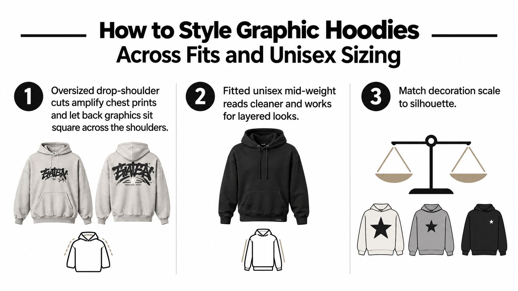
Decoration changes the silhouette. A large back print needs room to sit square across the shoulders, while a small embroidered crest looks sharper when the hoodie has cleaner proportions. Don't buy an oversized blank just because streetwear culture made volume popular. Buy volume when the graphic needs visual space or when the outfit has enough structure to control it.
Unisex hoodies commonly use a men's-measurement base. One industry sizing guide shows a typical graded range from XS through 3XL, with chest widths scaling from about 34 to 36 inches at XS to 46 to 48 inches at 3XL. This unisex hoodie sizing guide is useful as a framework, but always check the garment's own measurements before ordering.
Match the cut to the graphic
An oversized drop-shoulder hoodie amplifies a chest print and gives a back graphic a broad, deliberate frame. Pair it with slim or straight-leg denim, cargos with a controlled taper, or simple trousers. Too much volume below the waist makes the artwork compete with the entire outfit.
A fitted or mid-weight unisex hoodie works better with a small embroidered crest, stacked sleeve hits, and layered outerwear. It slips under a cropped jacket, bomber shell, or trench coat without creating excess bulk. Keep the shoulder seam close enough to frame the chest mark, and make sure the neckline doesn't collapse into the artwork.
Use size as a styling tool
- True to size: Choose this for a cleaner fit that layers beneath jackets.
- Size up once: Use this for intentional oversized drape, especially with drop shoulders and large back graphics.
- Size down carefully: This can create a closer, cropped layered read, but only if the body length and shoulder width still sit correctly.
The unisex sweatshirt sizing reference helps translate measurements into a more reliable purchase. Measure a hoodie you already like from pit to pit, then compare that width with the product chart. Don't rely on the label alone, especially when a “large” can mean a neat fit in one blank and a dramatic streetwear fit in another.
Proportion check: Let graphic-heavy hoodies carry the attention. Keep the trousers cleaner, then add texture through footwear, a bag, or the outer layer.
Tonal embroidery is different. It can handle wide-leg trousers because the graphic is quieter and the texture adds polish without shouting. That's the lane for premium minimalism, gallery nights, and NYFW-adjacent outfits where the silhouette does more talking than the logo.
NYC Outfit Pairings That Make the Graphic Hit Harder
NYC styling rewards contrast. A hoodie can look rough, polished, or deliberately exaggerated depending on what frames it. The graphic doesn't need more noise around it. It needs the right city uniform.
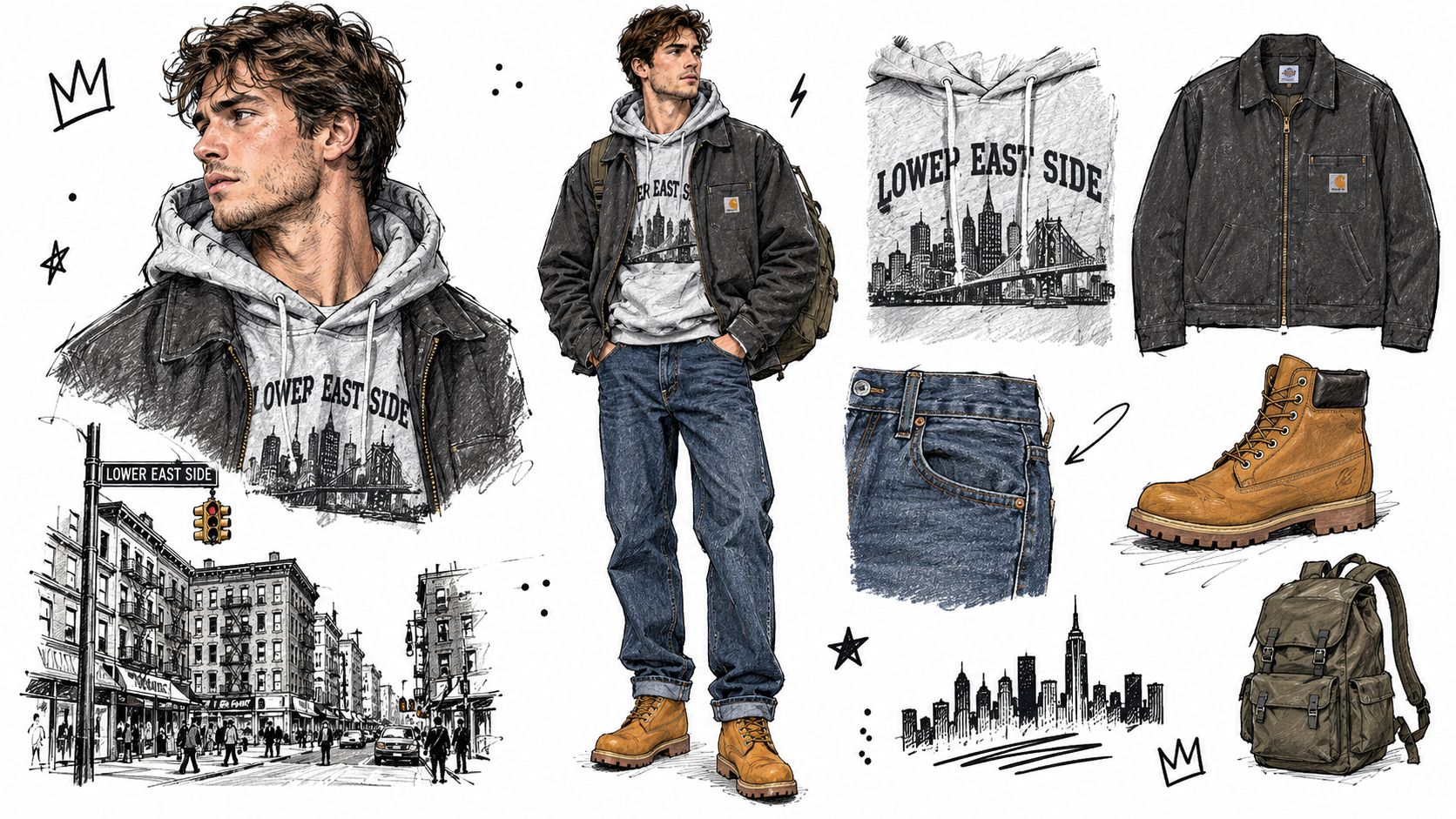
Lower East Side daytime
Start with a heavyweight printed hoodie under a charcoal workwear jacket. Wear it with raw denim and beat-up high-tops for a Lower East Side run when the weather is cold enough for layers but not severe enough for a full parka.
Let the hoodie own the color and artwork. Keep the jacket matte and neutral, and don't add a loud cap or competing scarf. The raw denim gives the print a grounded frame, while worn sneakers keep the outfit from looking too catalog-perfect.
Soho gallery night
For a Soho gallery opening, switch the volume down. Wear a tonal embroidered hoodie under a long camel topcoat, then add pleated trousers and Chelsea boots. Embroidery earns its premium reputation. The texture reads up close, while the restrained palette works under gallery lighting and avoids the obvious streetwear uniform.
The fit should be neat enough for the coat to close without pulling across the chest. Let the hood sit naturally behind the collar, and keep the trousers wide enough to balance the coat without swallowing the hoodie.
Bushwick after dark
An oversized puff-print hoodie belongs in a more expressive night-out formula. Pair it with relaxed cargo pants, retro runners, a beanie, and a crossbody bag worn high enough to frame rather than cover the chest graphic.
This is a strong NYFW-coded move because the outfit uses texture and proportion instead of relying on a recognizable luxury logo. Puff ink already creates dimension, so the rest of the fit should stay functional. Use the cargos for shape, the runners for color relief, and the bag as a practical line across the torso.
The NYC graffiti embroidery hoodie reflects how New York-coded artwork can operate as a streetwear signal, not merely as cold-weather branding. That identity works best when the styling supports it. Don't bury the mark under a scarf, oversized vest, or second statement graphic.
The video below offers another visual reference for putting the garment, denim, and footwear into a cohesive streetwear outfit.
Care Routine That Keeps the Design Looking New
Graphic hoodie care should follow the decoration, not a generic laundry habit. Ink reacts badly to heat, flexing, and abrasion. Embroidery resists fading, but loose threads, backing, and raised borders can still snag or distort.
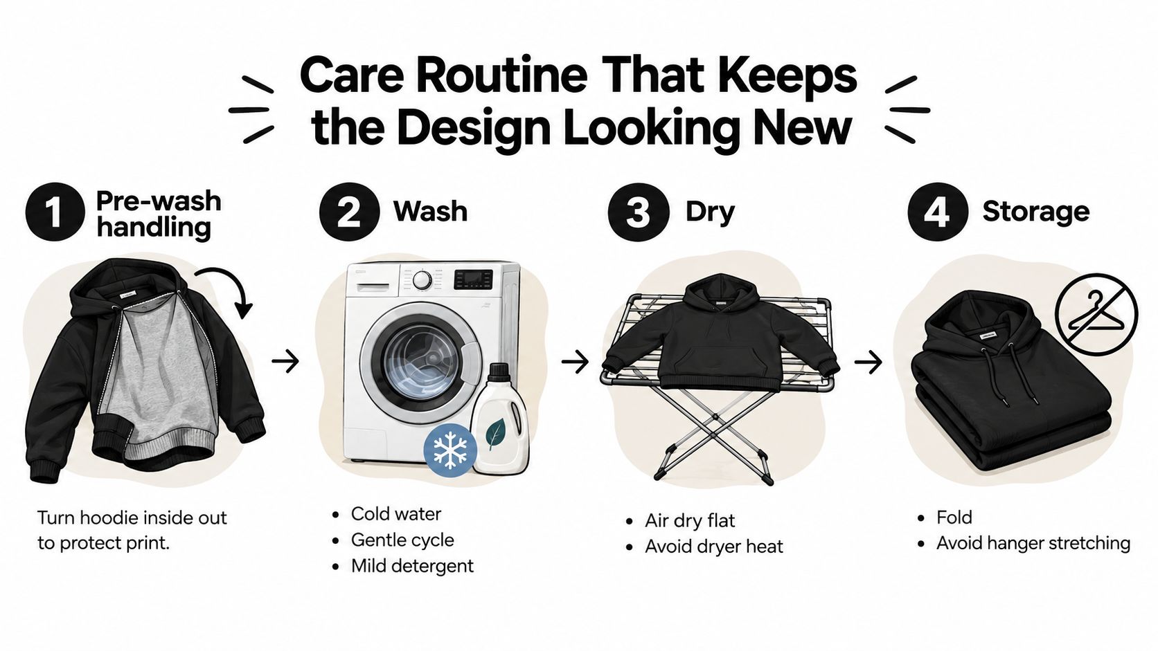
Before the machine
Turn the hoodie inside out before washing. That keeps the graphic away from direct friction inside the drum and reduces contact with other garments. Spot-treat marks with cold water and mild detergent rather than scrubbing the printed or stitched area aggressively.
Zip hardware closed and secure any drawcords. A zipper pull can scrape a print, while loose hardware can catch embroidery borders. Put heavily embellished hoodies in a mesh laundry bag when the decoration has raised elements or patches.
Wash with restraint
Use a cold cycle and gentle spin. Choose mild detergent, and skip bleach and optical brighteners because they can fade plastisol and affect embroidery thread color. Don't overload the machine. A crowded drum increases rubbing, which is exactly what large prints and exposed stitchwork don't need.
Turn the hoodie inside out every time, not only when the graphic looks vulnerable. Repetition is the care system.
Dry without cooking the artwork
Low-heat tumble drying is safer than high heat, but flat drying or air drying is the better move when you have time. Never wring a printed area. Twisting puts concentrated stress on the ink film and can stretch the surrounding knit.
Lay the hoodie flat with the graphic facing up, smooth the shoulders and hem, and let the fabric regain its shape naturally. Keep it away from direct, harsh sunlight while damp, especially when the artwork uses darker or saturated colors.
Ironing, steaming, and storage
Never press an iron directly onto a print, puff surface, patch, or raised embroidery. Use a cloth barrier and low heat, or steam from the reverse side while keeping the nozzle away from the decoration.
Fold graphic hoodies rather than hanging them for long periods. Hangers can stretch the shoulders and pull against heavy chest embroidery. Once dry, fold the garment with the graphic protected from rough surfaces.
Routine to keep: Inspect before washing, clean cold and inside out, dry flat when possible, then fold once completely dry.
Picking Graphics With Real Shelf Life in 2026
Don't chase whatever graphic went viral this week. Trend speed is a weak buying filter. A hoodie earns shelf life through strong artwork, stable construction, and a decoration method that can age without looking damaged.
The designs that tend to stay useful include tight-registration screen prints, tone-on-tone embroidery, archival artwork, heritage marks, and collaborations connected to a genuine cultural moment. They have a visual reason to exist beyond the feed. A simple embroidered crest on a strong blank can outlast a louder graphic printed with cheap ink.
The fast-flop category is easier to spot:
- Dated meme references: They depend on a joke losing relevance.
- Overworked chest stacks: Too many small elements turn into visual clutter.
- Shallow licensed tie-ins: Recognition alone doesn't create a wearable design.
- Heavy puff on weak blanks: Raised ink can't rescue poor fabric or sloppy construction.
Before checkout, ask yourself:
- Would I wear it on an ordinary Tuesday?
- Does the decoration suit the artwork's scale?
- Will the fit frame the graphic instead of swallowing it?
- Can I wash it cold, inside out, and with low heat?
- Does the design still work without the trend label?
DM-FlexWear's NY Crown Crest Embroidered Hoodie applies that method-first logic to an NYC-rooted staple, with adult sizing from S through 3XL and multiple colorways listed by the retailer. DM-Flexwear.com also offers coordinated tees, hoodies, crewneck sweatshirts, and baby apparel built around the same crown crest identity, making it relevant for shoppers who want a consistent family look rather than a one-off graphic.
Visit DM-Flexwear.com to browse embroidered NYC-rooted hoodies, crewnecks, tees, and coordinated family staples. Choose the decoration method and fit first, then build your everyday streetwear rotation around pieces that can handle real wear.