
You're staring at two blanks on the table, one heavyweight hoodie for ink, one for thread, and both mockups look clean enough to green-light. That's the trap with screen print vs embroidery. On paper, both can ship a strong drop. In practice, the wrong choice on the wrong garment makes the piece feel cheaper, wear worse, or miss the whole streetwear point.
The core decision isn't “cheap or premium.” It's garment type, placement, and how the piece is supposed to live. On a heavyweight hoodie or crewneck, the decoration changes the drape, the hand-feel, and the way the logo reads in the room. On a tee, the same choice can flip completely. If you're buying for a streetwear line, a family drop, or a brand that needs to feel right on first touch, you need the production answer, not the textbook one.
| Criteria | Screen Print | Embroidery |
|---|---|---|
| Best use | Flat graphics, tees, full-front hits | Small logos, premium staples, textured marks |
| Look | Smooth, graphic, modern | Raised, dimensional, premium |
| Feel | Lays flat on fabric | Adds physical stitch texture |
| Durability | Depends on curing and ink quality | Stitched thread holds up longer |
| Cost at scale | Better for large runs | Better for small, simple placements |
| Best placement | Full chest, back prints, sleeves | Left chest, cuff marks, crest logos |
Table of Contents
- The Hoodie on Your Desk and the Choice You Have to Make
- What Screen Printing and Embroidery Actually Do to a Garment
- Durability, Look, and Feel Side by Side
- Cost Breakdown by Order Size and Design
- Why Embroidery Wins on Premium Staples
- When Screen Print Is Still the Move for Streetwear
- Picking the Right Method for Your Drop
The Hoodie on Your Desk and the Choice You Have to Make
A buyer in a Lower East Side studio can stare at two hoodies all day and still miss the point. One mockup puts the crown logo in flat ink across the chest. The other tucks the same crown into raised thread on the left chest and again across the back. Both look fire in the file. Both quotes might sit within a few dollars of each other. Only one is right for the garment.
The hoodie changes the rules
Heavy fleece doesn't behave like a tee. It has weight, structure, and surface texture, so the decoration sits differently and reads differently in person. That's why the old price-versus-quality framing misses the actual decision. On a heavyweight hoodie, the better question is which method respects the garment.
If you're buying for something that needs to feel premium in hand, thread usually gives you more presence. If you're building around a larger graphic or a louder statement, print makes more sense because it keeps the artwork cleaner and more expansive. DM-FlexWear's premium hoodies sit in that exact lane, where the blank itself already carries weight and the decoration has to match it.
Practical rule: let the garment lead. Heavyweight fleece wants a decoration that looks intentional, not one that just fills space.
That's the streetwear move. Not choosing the method you've heard about the most, but choosing the one that fits the piece on the table. A hoodie can carry a chest hit, a back hit, or a full graphic, but each placement tells a different story. Buyers who treat those as the same order end up with merch that looks assembled instead of designed.
What Screen Printing and Embroidery Actually Do to a Garment
Screen printing pushes ink through a mesh stencil and lays it onto the fabric in separate layers, one color at a time. Embroidery uses a programmed needle and thread to sew the design into the garment stitch by stitch. That difference is the whole game, because one method sits on the fabric while the other becomes part of it.
Ink sits on top, thread cuts in
Screen print is a surface layer. Done well, it gives you crisp color and a clean visual hit, especially on flat graphics. Plastisol sits on top of fibers rather than into them, and that's why the finish can crack if curing is off. A technical guide notes that poorly cured plastisol can crack and wash out after 1 to 3 cycles, while a properly cured print can survive 50+ wash cycles. Total Ink's plastisol guide makes the mechanical issue pretty obvious.
Embroidery does the opposite. The thread is stitched into the cloth, so you're not just decorating the surface, you're changing how the fabric feels and holds the mark. That's why embroidery resists cracking and peeling in a way print can't. It also means the garment has to carry the stitch density, which is why it belongs on fleece, heavier tees, and structured pieces more than thin knits.
If you want the short version, here it is. Print is a visual layer. Embroidery is a structural layer. Once you understand that, the placement decisions get a lot sharper, because you stop asking what looks cool on screen and start asking what survives on the actual blank.
Durability, Look, and Feel Side by Side
Durability is where embroidery earns its reputation. One apparel comparison says screen-printed ink typically lasts about 40 to 100 wash cycles before fading or cracking, while embroidery resists cracking and peeling because the thread is stitched into the fabric rather than sitting as a surface film. Printify's comparison and the uniform-focused guide from NW Custom Apparel both point to the same basic truth, embroidery tends to hold edge definition longer.
The scan test buyers actually use
| Criteria | Screen Print | Embroidery |
|---|---|---|
| Durability | Strong when cured correctly, but the ink layer can crack or fade | Stitched thread resists cracking and peeling |
| Look | Flat, sharp, good for detailed artwork | Raised, textured, premium, more tactile |
| Feel | Soft and low-profile on the garment | More physical, especially on thin tees |
| Best placement | Full-front graphics, back prints, large art | Left chest, small crests, logo hits |
Look is where print still wins some fights. It handles detailed art, clean type, and big visual fields without turning the design into a stitched approximation. Embroidery gives you depth, but it won't mimic a gradient or a photo the way ink can. That's why print owns graphic tees and embroidery owns the small, premium placement that buyers notice when they get close.
Feel is the streetwear tell. Ink lays flat and stays out of the way. Thread sits raised and can feel too heavy on lighter jerseys, but on heavyweight fleece it reads as intentional and expensive. That's the difference between a piece that feels printed on and a piece that feels built.
Real production rule: if the logo has to be seen from across the room, print. If it has to be felt up close, embroidery.
Placement decides a lot of this too. Left chest, cuff hits, and small back neck marks are embroidery territory. Full-front artwork, oversized back graphics, and anything that needs wide color fields belong in screen print. Buyers who separate those use cases stop wasting time comparing methods as if they're interchangeable.
Cost Breakdown by Order Size and Design
The cheapest option depends on what you're making, not what you call the vendor about first. Screen printing usually wins at scale because setup costs get spread across more units. Embroidery can be cheaper on smaller, premium placements because it doesn't need the same screen setup, but it gets more expensive as stitch count and complexity rise. An embroidery pricing guide notes digitizing and setup often land around $25 to $60 per design, and another supplier notes a $25 minimum before design and digitizing charges. Stitchery's pricing notes make the structure plain.
Where the math changes
A small left-chest logo on a hoodie is the sweet spot for embroidery. A large front graphic or an all-over back hit is not. Once stitch count climbs, embroidery takes more machine time per piece, and the price follows that complexity. Screen printing does the opposite, because a bigger run with a straightforward design lets the setup cost get diluted across the order.
| Order Size | Screen Print (per unit) | Embroidery (per unit) |
|---|---|---|
| Small run | Usually higher because setup is spread across fewer pieces | Often better for simple logos and small placements |
| Medium run | Improves fast if the art is simple | Holds up well if stitch count stays low |
| Large run | Usually the stronger buy | Rarely makes sense for large graphics |
Design complexity matters more than buyers want to admit. A clean left-chest crown is one thing. A dense back graphic with multiple colors, fine lines, or oversized coverage is another. The embroidery machine isn't the place to force that kind of art, and it'll show in the quote long before it shows in the garment.
For mixed-size family apparel, the same design can behave very differently across adult tees, hoodies, crewnecks, and baby sizes. That's the gap most comparison guides ignore. A small thread mark might look perfect on a hoodie and absurd on a baby tee, while a print can scale more naturally across the range. That's why your size mix and placement plan matter as much as the artwork itself.
Why Embroidery Wins on Premium Staples
Embroidery wins when the blank already has weight and the brand wants the decoration to feel like part of the garment. On hoodies and crewnecks, stitched thread sits on top of the fleece with dimension that print can't fake. That raised texture catches light, adds presence, and makes even a simple crest feel deliberate.
The premium read is tactile
Touch matters in streetwear. A flat print can look clean, but a raised chest logo changes the way the piece lands in hand. That's a real value cue, and buyers feel it immediately. It's why tonal embroidery on tonal blanks keeps showing up in high-end collections, the logo stays quiet, but the finish still signals care.
Embroidery also ages better on staples people wear hard. It doesn't crack like a weak print layer, and it doesn't need to fight for visibility after repeated laundering. That matters if the hoodie is supposed to look better in year three than it did fresh out of the box. For a crewneck with a crest or small logo, that longevity is usually the right call.
DM-FlexWear's embroidered crewneck sweatshirt fits this logic exactly, because the garment is built for a textured logo that belongs on fleece instead of floating on top of it.
Buyer takeaway: if the blank is the hero, embroidery usually helps. If the artwork is the hero, print usually takes over.
This is also where premium staples separate from promo gear. A hoodie with a small embroidered chest mark feels closer to a fashion piece than a flyer for an event. That's the lane streetwear brands keep paying for, especially when the rest of the garment is already doing the visual work.
When Screen Print Is Still the Move for Streetwear
Screen print is still the move when the design is doing all the talking. Graphic tees, oversized back prints, and artwork with gradients or fine linework belong here. Embroidery can't reproduce that detail density without getting muddy, and nobody wants a stitched version of art that should've stayed flat.
The crown looks different on a tee
A DM-FlexWear-style crown on an adult heavyweight tee and the same crown on a baby tee aren't the same production problem. On the tee, if the crown needs sharp edges and clean fill across a larger area, print keeps it readable. On the baby size, the footprint gets smaller fast, and that's where thread can start to feel too heavy for the garment. Their graphic tees category shows exactly why placement and scale matter more than a one-size-fits-all rule.
Screen printing also keeps the drape softer on lightweight cotton. That matters on tees where you don't want the logo to fight the garment. A screen-printed hit sits flatter, feels less intrusive, and works better when the art is wide or the piece needs to hang clean.
Practical rule: if the design wants room, print it. If the design wants texture, stitch it.
There's still a ceiling for this. If the artwork is too complicated, embroidery gets expensive and awkward. If the tee is too light and the graphic is too small, print can be the cleaner choice for family matching or coordinated drops. Limited runs can still make sense in screen print when the art earns the setup, even if the order isn't huge.
Picking the Right Method for Your Drop
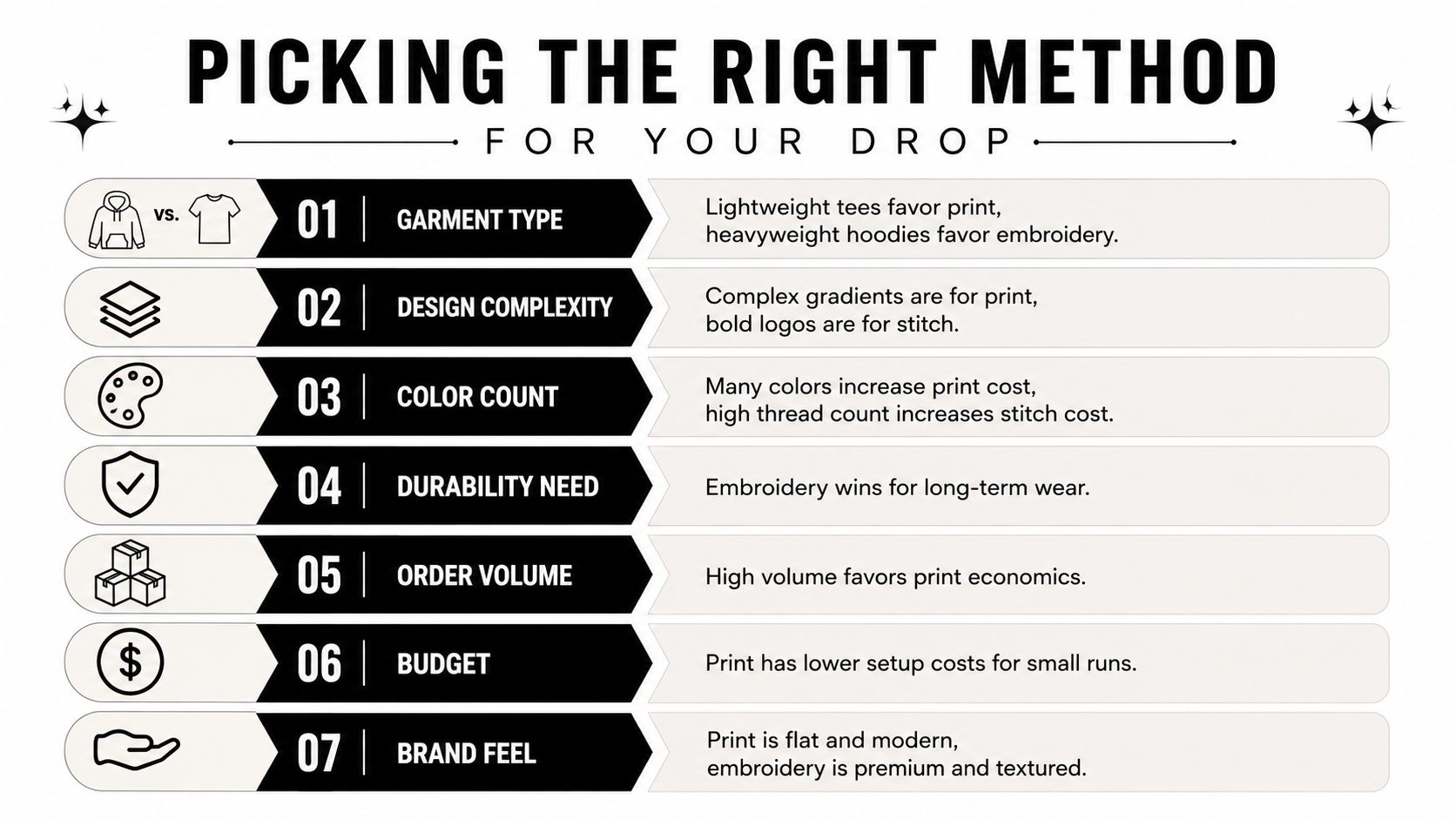
Use the garment first, not the decoration. Heavyweight hoodie or fleece crewneck, embroidery is usually the safer call. Light cotton tee, especially with a big front or back graphic, screen print is usually the right answer. That alone kills most bad decisions before sampling even starts.
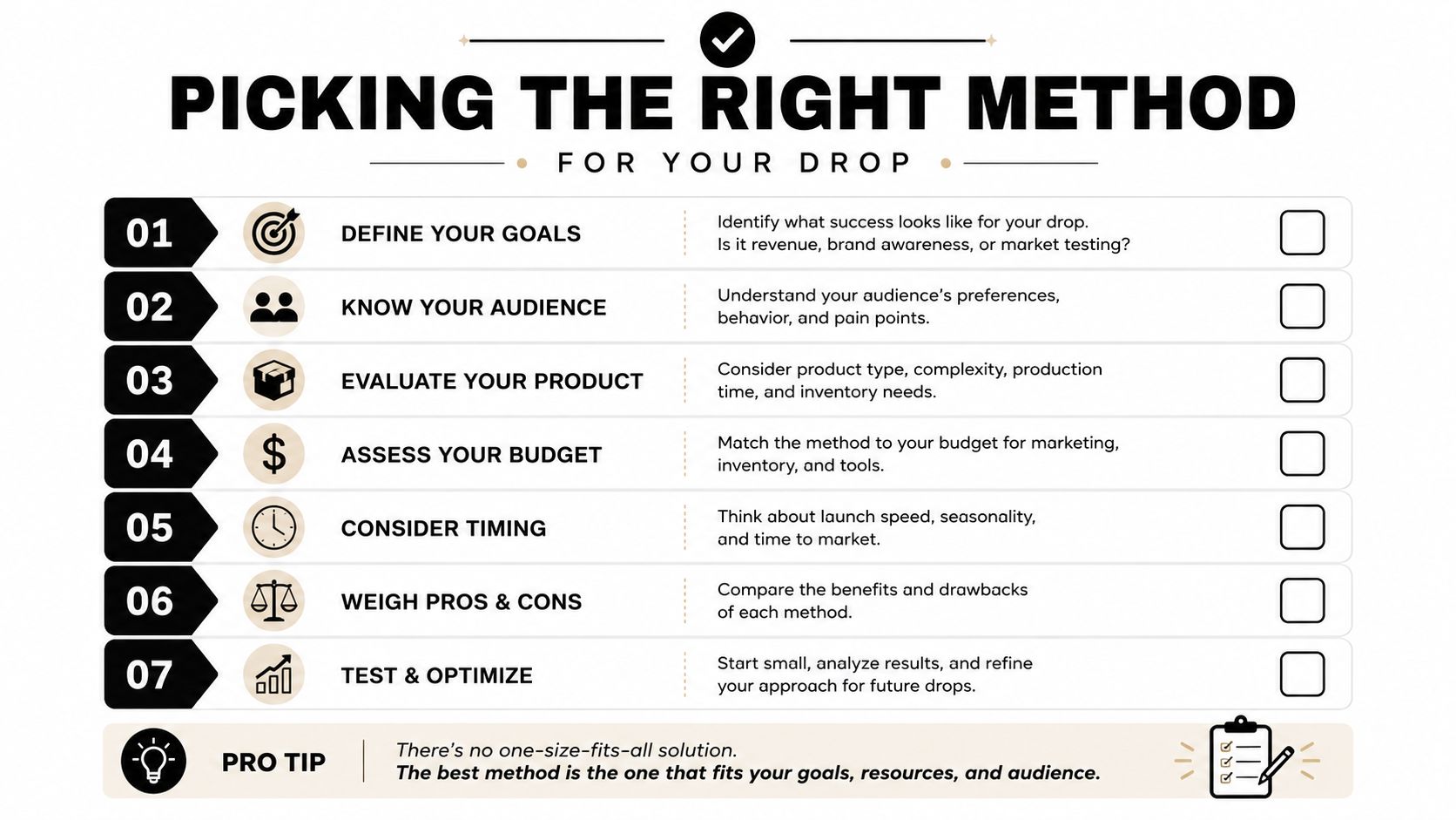
Run the drop through seven filters
- Garment type. Heavy fleece leans embroidery, lightweight tees lean print.
- Placement. Left chest and small marks favor thread, full chest and back graphics favor ink.
- Artwork size. Bigger art needs print space, not stitches stacked into a corner.
- Color count. More color complexity pushes the conversation toward print.
- Order volume. Bigger runs usually favor screen printing economics.
- Deadline pressure. Faster setup is nice, but not if the result looks off.
- Brand feel. Flat and graphic says one thing, raised and textured says another.
The production mistake happens when a buyer starts with budget and ends there. That's backwards. Budget matters, but the blank, the art, and the placement decide whether the money is well spent. A cheap method that fights the garment costs more than it saves.
For streetwear brands, my call is simple. Use embroidery for premium staples, crest logos, and anything meant to feel collected, not just worn. Use screen print for loud graphics, tees, and pieces that need visual punch across a bigger canvas. If you're still torn, mock up both before sampling, because the right answer usually shows itself the second the logo meets the fabric.
DM-FlexWear.com carries staple tees, hoodies, and crewneck sweatshirts built around the NY Crown Crest look, so it's a clean place to test how print and embroidery read across real blanks. If you're choosing between screen print vs embroidery for a drop, visit DM-Flexwear.com and compare the garment first, then decide how you want it decorated.