

You've got two sweatshirts in your hands, same color family, same general vibe, both with a small embroidered crest, and one is somehow twice the price. From a few feet away they look close enough. Then you put them on, run a thumb over the logo, tug the chest panel once, and the difference gets loud fast.
The cheap one already feels tired. The embroidery sits like a stiff patch jammed into soft fleece, the fabric dimples around it, and the whole thing looks like it'll twist after laundry day. The better one feels settled. The logo sits flat, the sweatshirt keeps its shape, and the piece reads expensive without yelling.
That gap is why the best embroidered sweatshirts deserve more scrutiny than most buyers give them. Embroidery isn't forgiving. Every stitch punches through the face fabric, compresses the fleece, and locks the design into the garment structure. If the base is wrong, the thread work exposes it immediately.
Table of Contents
- Why Embroidered Sweatshirts Deserve a Closer Look
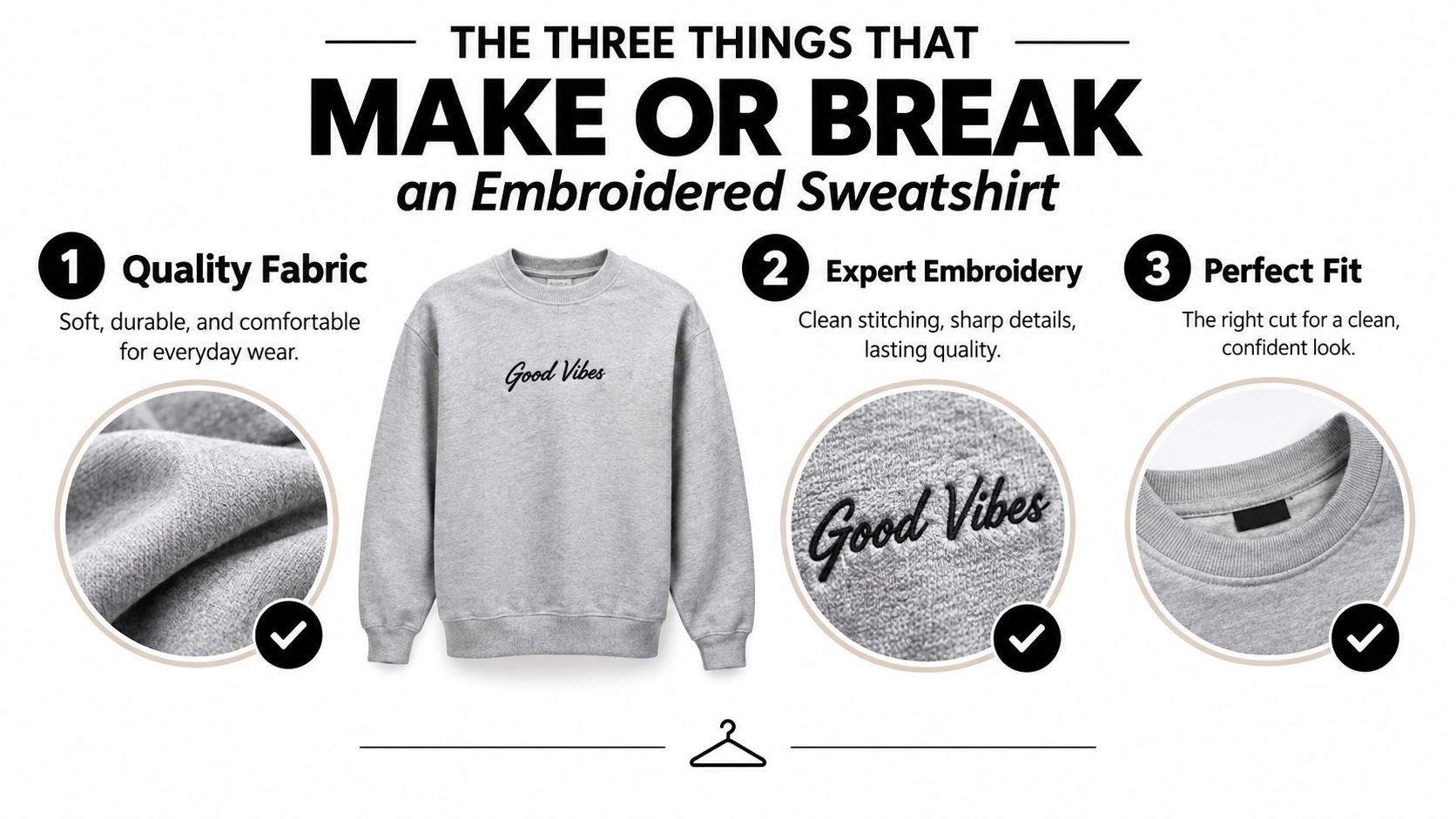
- The Three Things That Make or Break an Embroidered Sweatshirt
- Crewneck vs Hoodie and Why Fabric Weight Changes Everything
- Where the Logo Sits and Why Placement Matters
- A Real-World Example From DM-Flexwear
- How to Wash and Care for Embroidered Sweatshirts
- The Quiet Embroidery Trend Reshaping Streetwear
Why Embroidered Sweatshirts Deserve a Closer Look
Shop embroidered sweatshirts backwards. They judge the art first, then maybe the fit, and almost never the construction that decides whether the piece will still look good a year later.
That's a mistake, because embroidery is one of the toughest decoration methods a sweatshirt can carry. It doesn't float on top the way a basic print does. It asks the garment to hold tension, support stitch density, and recover after washing without turning the logo into a wrinkled little island.
The fitting room test tells the truth
You can see this in under a minute. Hold two nearly identical crewnecks side by side and look at the area around the embroidery, not just the embroidery itself. On the weaker piece, the chest panel looks slightly pinched, the fleece face gets uneven around the design, and the logo sinks into the fabric instead of sitting cleanly on it.
On the stronger piece, the panel stays calm. The embroidery has definition. Curves look intentional, text stays readable, and the fabric doesn't look bullied by the stitching.
The logo isn't the product. The way the sweatshirt carries the logo is the product.
That's why embroidered sweatshirts sit in a serious market, not some tiny novelty lane. One industry estimate put the global decorated apparel market at USD 28.98 billion in 2023, with a projection to USD 68.17 billion by 2030 and a 13.0% CAGR from 2024 to 2030. The same report says embroidery accounted for more than 40% of global decorated apparel revenues in 2023, while offline channels represented over 65% of sales (embroidery market data). That matters because it tells you embroidery isn't a fringe finish. It's one of the core ways apparel gets built and sold.
Three variables separate staples from regrets
When I judge the best embroidered sweatshirts, I care about three things first.
- Stitch quality: Is the embroidery tight, even, and properly tensioned, or does it show gaps, fuzz, and loose tails?
- Fabric weight: Does the sweatshirt have enough body to support the logo, or is the embroidery collapsing into a flimsy face?
- Placement: Is the design sitting on a stable panel, or on an area that bends, stretches, and puckers every time you move?
Learn to read those three variables and you stop buying hype pieces that peak on day one. You start buying sweatshirts that stay sharp.
The Three Things That Make or Break an Embroidered Sweatshirt
If you want to judge the best embroidered sweatshirts like someone who's lived in them, stop overvaluing the graphic and start grading the build. I can forgive a boring crest on a great sweatshirt. I won't forgive beautiful embroidery on a weak blank.
Stitch quality decides whether the logo looks premium
Good embroidery looks controlled. The thread sits tight and flat, with a slight raised feel that gives the design dimension without turning it into armor. Satin stitch details should look smooth on edges and borders. Fill stitch areas should look consistent, not patchy or rough.
Bad embroidery gives itself away fast:
- Gaps in coverage: You can see the garment peeking through where the fill should be solid.
- Loose tails or fuzzy edges: That's sloppy finishing.
- Visible backing from the front: Corner cutting, simple as that.
- Warped curves or cramped lettering: The digitizing or stitch setup wasn't matched to the fabric.
Stitch density matters here. Guidance from embroidery production sources is clear that density affects coverage, smoothness, and thread durability, but cranking density too high can create stiffness and puckering. Properly matched density and tension can help embroidered garments survive hundreds of wash cycles, while poor matching leads to unraveling, blur, and distortion (stitch density guidance).
Fabric weight is the non-negotiable
Too many shoppers get cooked. A logo can look decent on a rack and still fail because the sweatshirt underneath it is too light.
Independent apparel guidance consistently points to 280 to 320 GSM as the sweet spot for embroidered sweatshirts, because heavier fabrics support denser stitch fields without sagging. The same guidance warns that garments below about 200 GSM are more likely to show backing, lose logo definition, and pucker under higher stitch counts (fabric guidance for embroidered sweatshirts).
My opinion is stricter. 300 GSM is the floor for serious embroidered pieces. Below that, you're asking the sweatshirt to do a heavyweight job with a lightweight body.
Placement changes everything
The placement can save a design or ruin it. Left chest, upper back, sleeve, and center chest don't behave the same in real wear. A stable panel lets the embroidery stay crisp. A high-flex zone fights it every time the sweatshirt stretches, folds, or gets pulled over your head.
If you're trying to decide quickly in store or from product photos, use this one-minute checklist:
- Check the fabric body: If the chest panel looks thin or drapey, skip it.
- Zoom the stitches: Look for clean edges and even coverage.
- Watch the panel around the logo: If it ripples, the build is already losing.
- Note the logo location: Stable zones age better than stretch zones.
If you want the broader tradeoff between printed and stitched decoration, this breakdown on screen print vs embroidery is worth reading. But for sweatshirts meant to last, embroidery wins only when the base garment can carry it.
Practical rule: Don't buy embroidery you have to “trust” will settle after washing. Good embroidery looks right before you leave the store.
Crewneck vs Hoodie and Why Fabric Weight Changes Everything
Not every sweatshirt silhouette handles embroidery well. Some make the job easy. Some fight it from the start.
Crewnecks are the safer bet. Hoodies can work, but only when the brand knows exactly what it's doing and the fabric has enough structure to resist the pull of the stitching.
Why crewnecks usually win
A crewneck gives embroidery what it wants: a flatter front panel, fewer interruptions, and more predictable tension across the chest. That's why heritage sportswear and a lot of smarter streetwear labels keep putting crests on crewnecks. The silhouette lets the stitching read clean from across the room.
A hoodie adds complications. You've got the hood weight tugging at the neckline, the crossover seam near the collar, and often a front pocket seam that changes how the body hangs. Those uneven zones can make logos pull slightly off line or sit with more distortion than they would on a comparable crewneck.
For anyone comparing silhouettes, this guide to premium hoodies is useful for understanding what a hoodie has to get right before embroidery even enters the conversation.
Why weight changes the result
A 300 GSM fleece holds embroidery on top of the surface. A 200 GSM sweatshirt often lets the stitches sink into the face, especially if the knit is soft and airy. The result is a logo that looks less defined, less raised, and more vulnerable to puckering.
Heavier or more stable fabrics are widely favored for embroidery because they hold structure better. One apparel guide specifically points to heavyweight cotton as a strong option for sweatshirts and casual wear, while cotton-poly blends are described as a very good all-around choice for general apparel and promotional items (best fabrics for embroidery).
| Construction | 200-240 GSM | 280-320 GSM | 350+ GSM |
|---|---|---|---|
| Crewneck | Wearable, but dense crests often sink and soften in definition | Best overall zone for most embroidered crewnecks | Excellent for bold crests, raised texture, and long-term shape |
| Hoodie | Riskier because seams and hood weight amplify distortion | Can work well if placement stays on stable zones | Strongest hoodie option, especially for small left-chest logos |
| Heavy embroidery coverage | Usually a bad idea | Safe if digitizing and backing are matched well | Ideal if you want a substantial, premium embroidered feel |
The simple buying rule
Match the garment construction to the ambition of the embroidery. If the logo is dense, detailed, or raised, buy the heavier crewneck. If the hoodie is lighter, keep the embroidery smaller and simpler.
That sounds basic, but most bad buys happen because people fall for the crest first and inspect the sweatshirt second.
Where the Logo Sits and Why Placement Matters
Placement gets ignored because people assume a good logo looks good anywhere. It doesn't. The best embroidered sweatshirts place the design where the garment can support it through wear, washing, and regular movement.
A small crest on the wrong panel can look worse than a simple mark placed well.
The safest placements
Independent guidance consistently points to left chest, center chest, sleeves, and upper back as the standard safe placements, with left chest, sleeves, and upper back generally giving better wearability when the design is handled correctly (embroidered sweatshirt placement guidance).
Left chest is the easiest win. On a crewneck, that upper-left panel is stable, visible, and less affected by hard stretching than the dead center of the chest. If you want a crest that reads premium and stays clean, I'd start almost every time.
Center chest is louder, but it's also trickier. That area takes more movement, especially when the sweatshirt pulls across the torso. Dense embroidery there can create drag and visible waviness if the backing or hooping isn't dialed in.
Here's a quick breakdown.
| Placement | Distortion Risk | Visibility | Best For |
|---|---|---|---|
| Left chest | Low | High without being loud | Crests, monograms, understated branding |
| Center chest | Medium to high | Very high | Simpler logos on stable, heavier sweatshirts |
| Sleeve | Medium | Moderate, stylish up close | Secondary marks, text, minimal icons |
| Upper back | Low to medium | High | Larger artwork that needs more panel space |
The video below shows the kind of embroidery handling and placement thinking buyers should pay attention to when judging finish quality.
The size rule most people ignore
If the design gets wider than 5 inches, I'd keep it off the chest and move it to the upper back. That panel usually absorbs tension better and gives the artwork room to breathe. Trying to force a broad, dense crest onto the chest is how you end up with puckering that shows up before the first wash.
Sleeve embroidery can look great, especially on heavier fleece. The sleeve benefits from a more anchored shape near the cuff, so smaller logos or text can read surprisingly crisp there. But if the embroidery sits too close to ribbed cuffs or hems, the knit can bunch and telegraph every bit of tension.
A logo should sit on the garment, not fight the garment.
What to inspect before buying
Look at the area around the embroidery, not just the motif.
- Panel smoothness: The fabric around the logo should stay flat.
- Distance from ribbing: Dense crests too close to cuffs, hems, or collar ribs often pucker.
- Backing discipline: Good backing and hooping keep the motif from waving after wash one.
- Drape: The sweatshirt should still hang naturally with the logo in place.
A lot of overhyped pieces fail. The branding is fine. The placement is lazy.
A Real-World Example From DM-Flexwear
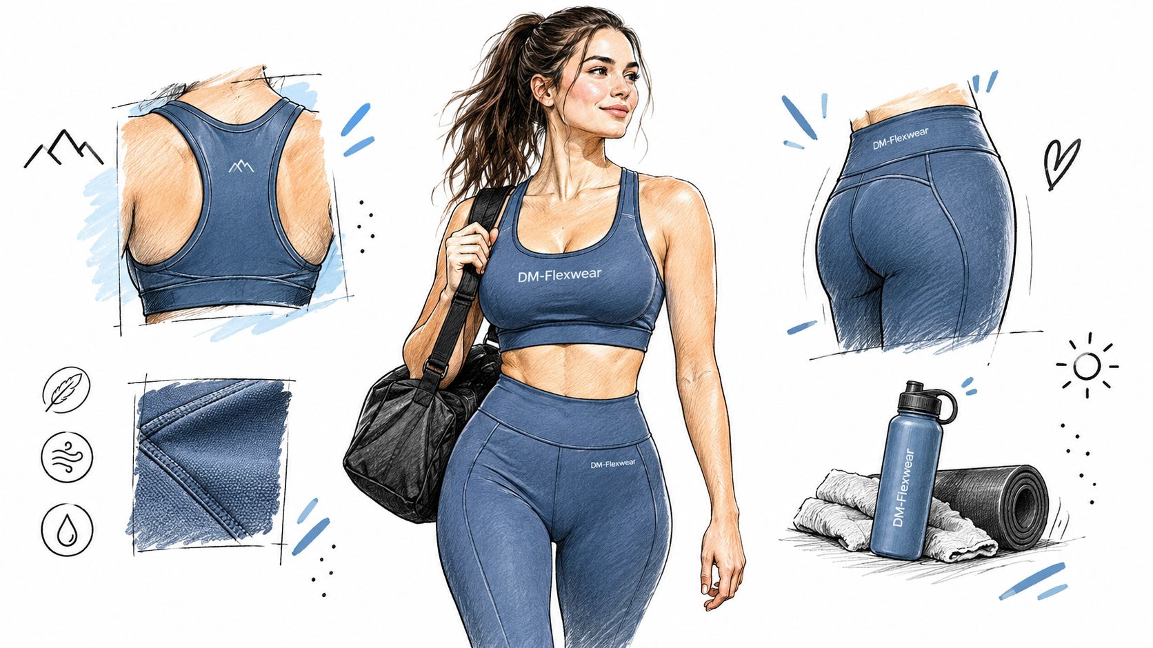
A useful example of good embroidery decisions is the NY Crown Crest Heavyweight Crewneck from DM-Flexwear. It gets the fundamentals right before it tries to impress you with branding, which is exactly how a piece like this should be built.
The base matters first. This crewneck uses 400 GSM cotton fleece, which gives the embroidery enough structure to sit cleanly without collapsing into the surface. That weight puts it firmly in heavyweight territory, and you can feel the difference immediately in how the chest panel holds a crest.
Why this one works
The crown crest sits on the left chest, which is the smartest call for a dense embroidered mark. That upper panel is stable, easy to read, and less likely to distort than a broad center-chest placement. The ribbed collar and cuffs stay clear of the design, so the sweatshirt doesn't invite the kind of bunching that ruins the line of the embroidery.
The NY crown motif also carries some actual cultural relevance instead of feeling like random filler. New York remains one of fashion's strongest streetwear signals, and New York Fashion Week still matters as a global style platform with visible influence in street-style coverage (NYFW street style coverage). That gives the crest more weight than a generic badge slapped on a blank.
What it shows about good construction
This piece works as a template for what a well-engineered embroidered crewneck should feel like.
- Heavy fleece base: The fabric has enough body to support dense thread work.
- Stable crest placement: Left chest keeps the logo readable without overloading the garment.
- Clean visual balance: The embroidery doesn't crowd the ribbing or pull the silhouette off shape.
- Streetwear relevance: The NY crest language fits the NYC and NYFW ecosystem without trying too hard.
I also like that it doesn't need oversized decoration to make a point. That restraint usually ages better than loud branding, and on a heavy crewneck it reads sharper.
How to Wash and Care for Embroidered Sweatshirts
You pull a sweatshirt out of the wash and the body still looks fine, but the embroidery has gone flat, fuzzy, or slightly rippled. That usually comes from bad care, not bad design. Embroidery is durable, but it is not indestructible, especially on heavyweight fleece with dense stitching and backing sitting in one area of the chest.
Stitched decoration holds up better than many printed finishes because the design is sewn into the garment instead of sitting on top of it, which helps it resist peeling and cracking over time (embroidery durability overview). The weak points are friction, heat, and moisture trapped in thick fabric. That matters more on a 300 GSM crewneck than a thin sweatshirt because heavier fleece takes longer to dry, and the embroidered panel can stay stressed if you handle it wrong.
The wash routine that keeps embroidery sharp
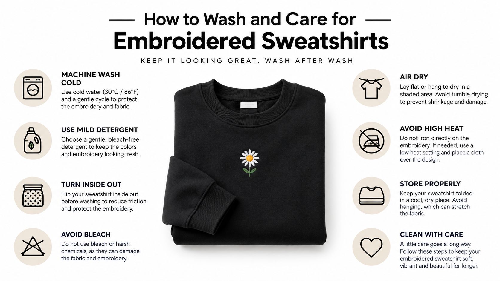
Wash in cold water, 30°C or lower. Turn the sweatshirt inside out before it hits the drum. If the piece has raised stitching, satin fills, or a dense crest, put it in a mesh laundry bag so the thread is not scraping against denim hardware, zipper teeth, or rough towel loops for forty minutes.
Use mild detergent. Skip bleach and skip aggressive brighteners. Colored thread loses its clean finish fast if you keep hitting it with harsh formulas.
If you want a product-specific reference point, this guide to an embroidered crewneck sweatshirt shows the kind of piece that benefits from careful washing.
Heat does more damage than soap
Dryers ruin more embroidered sweatshirts than washers do.
High heat can shrink the base fabric unevenly around the stitched area, flatten the thread, and stress the backing that keeps the logo stable. That is how you end up with puckering around the design and a chest panel that never sits clean again. Flat drying on a towel is the safe call. If you need to hang dry, support the garment evenly and keep it out of direct sun.
Ironing needs the same level of discipline. Never press directly on the embroidery. Use a pressing cloth, or apply light steam from the reverse side so you do not crush the stitch texture.
Storage rules for heavyweight pieces
Heavy embroidered crewnecks should be folded, not left hanging from skinny hangers. The shoulder line stretches, the chest panel starts pulling downward, and the embroidery can sit awkwardly because the fabric around it is no longer balanced.
Spot cleaning matters too. Dab around the stitched area with a soft cloth. Do not scrub straight across the threads unless you want fuzzing and loose ends.
Quick care checklist
- Wash cold: Keep it at 30°C or below.
- Turn inside out: Reduce abrasion on the face of the embroidery.
- Use a mesh bag for dense logos: Protect raised stitching from hardware and rough fabrics.
- Choose mild detergent: Strong formulas wear down thread finish.
- Skip high heat: Flat dry if you want the embroidery to keep its shape.
- Fold for storage: Heavy fleece and chest embroidery hang badly over time.
- Avoid direct ironing: Steam or use a pressing cloth from the reverse side.
A well-built embroidered sweatshirt can age beautifully. A lazy wash routine can make an expensive piece look cooked in a month.
The Quiet Embroidery Trend Reshaping Streetwear
You spot it fast in a good shop. One crewneck has a giant center logo with shiny thread and too much attitude. The other has a tight tonal crest on the left chest, heavy fleece, and embroidery that sits flat without warping the panel. The second one is usually the better buy.
Streetwear is getting quieter for a reason. Loud embroidery asks a lot from the garment. It needs more stitches, puts more tension into the face fabric, and shows every construction mistake after a few washes. Smaller, better-planned embroidery ages with less drama and usually looks more expensive because the build is doing the work, not the logo size.
Loud logos burn out faster
Big chest hits still sell on drop day. They also date a sweatshirt fast. Worse, they expose weak construction. On light fleece, a large stitched graphic can pucker, pull, and twist the front panel once the sweatshirt starts getting real wear.
That is why the current shift matters. Quiet embroidery is not just a style mood. It is better engineering.
A compact chest crest, tonal thread, or controlled 3D puff hit gives the fabric room to stay stable. You get cleaner drape, less distortion, and a sweatshirt that still looks sharp after repeated washes instead of one season of hype.
Why restrained embroidery keeps winning
The best pieces right now share a few traits:
- Tonal thread looks richer: It catches light and texture without turning the chest into a billboard.
- Smaller embroidery panels stay cleaner: Less stitch spread means less pulling across the garment face.
- Placement stays practical: Left-chest or off-center hits wear well with jackets, cargos, denim, and trousers.
- Heavy fleece carries subtle detail better: A 300 GSM sweatshirt can support dense embroidery without looking flimsy.
Fit also matters more than people admit. Clean embroidery works across more body types because it does not rely on one oversized graphic landing perfectly on every chest width. Nike's gender-neutral size chart shows how broad modern sweatshirt sizing runs, and that wider fit range favors simpler placement and more balanced proportions.
The smartest embroidered sweatshirt in the room usually has the least to prove.
That is where construction and taste meet. Dense stitching. Controlled placement. Heavy fabric with enough backbone to support the thread count. Quiet embroidery is reshaping streetwear because it lasts longer, wears easier, and looks better after the novelty wears off.
DM-Flexwear.com gets that part right with heavyweight staples, embroidered hoodies and crewnecks, and the NY Crown Crest identity across multiple colorways and sizes for adults and young kids. If you want a New York-coded sweatshirt built around durable embroidery instead of throwaway hype, start there.