

You're standing in front of the mirror in a tee that looked simple online. Then you notice the crown on the chest, the raised thread, and the way the heavyweight cotton holds its shape around it. A printed logo can catch attention from across the room, but an embroidered logo makes you look twice. That difference is the whole point of embroidered logo T-shirts.
The NY Crown Crest aesthetic sits in that quieter streetwear lane. It connects New York identity, classic emblem language, and the polished restraint you see around NYC fashion culture and NYFW, without turning the garment into a walking billboard. The logo matters, but so do the stitch direction, fabric weight, placement, and the way the tee feels after repeated wear.
Table of Contents
- The First Time You Pull On an Embroidered Tee
- What Makes Embroidered Logo T Shirts Look and Feel Different
- Durability, Cost, and Hand-Feel Trade-Offs to Weigh
- Embroidery Versus Screen Print and DTG on Heavyweight Tees
- How to Wash and Care for Embroidered Logo T Shirts
- Ways to Style Embroidered Logo T Shirts Day to Night
- Why Smaller Tonal Embroidery Is the New Premium Signal
The First Time You Pull On an Embroidered Tee
The first thing you notice isn't always the design. It's the slight resistance of the fabric as the tee settles over your shoulders, followed by the raised crest under your hand when you smooth the chest. A printed graphic feels like a surface treatment. Embroidery feels built into the garment.
That difference changes how you wear it. With a soft printed tee, you might treat the shirt as a casual base layer, something to throw on under a jacket or rotate through laundry without thinking much about it. A stitched logo asks for more attention. You check the logo before sitting against a rough surface, you fold the shirt instead of crushing it into a drawer, and you notice how the cotton and thread age together.
The effect is especially clear on heavyweight cotton. The body of the tee gives the embroidery a stable foundation, so a small crown crest can sit cleanly instead of sinking into thin jersey. You get a matte, raised surface rather than the slick finish of some inks. It feels closer to a woven badge or a traditional monogram, but without adding a separate patch to the chest.
The streetwear signal: A restrained embroidered logo doesn't need to shout. Its value comes from the garment's weight, the quality of the stitch, and the confidence to leave space around the mark.
That attitude has deep roots. Historical evidence places embroidery as far back as 30,000 BC, with Chinese embroidery documented around 3,500 BC. It spread more widely through Europe around 1,000 AD and became more accessible during the Industrial Revolution in the 1800s, according to this brief history of embroidery. Monograms also served as identity markers in ancient Greece and Rome, later gaining prestige in the 15th century.
A modern NY Crown Crest tee draws from that same instinct. The crest identifies the wearer, but the stitched construction makes the identity feel considered rather than disposable. You can wear it with cargos, denim, wool trousers, or a hoodie over the top. The garment keeps earning its place because the decoration has substance, not just visual volume.
What Makes Embroidered Logo T Shirts Look and Feel Different
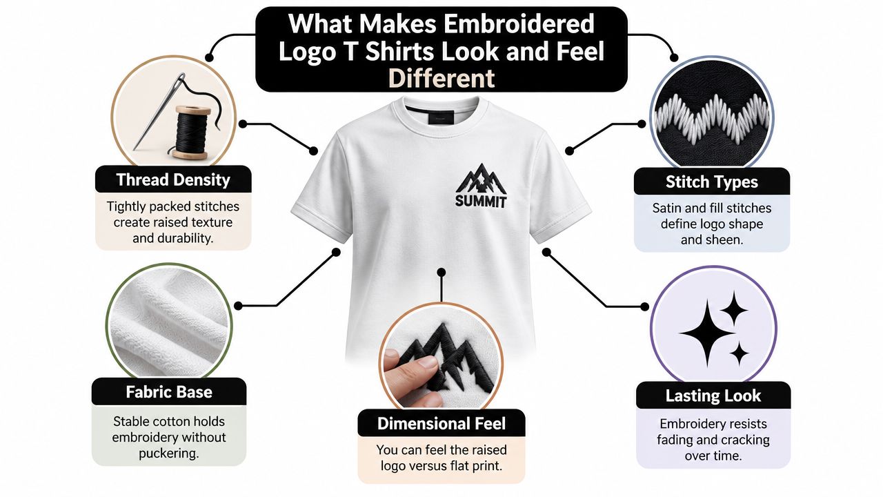
Embroidery starts with a needle passing thread through the shirt and a stabilizing backing. The machine follows a digitized path, building the logo from different stitch types. Think of the process as drawing with thread instead of ink. Every direction, overlap, and filled area affects the final surface.
Stitch density is the main control. It describes how closely the stitches sit together. Denser stitching improves coverage and edge definition, but it also adds thread, machine time, and stiffness. Industry guidance places satin stitch density around 0.35 to 0.45 mm, fill stitches around 0.4 to 0.5 mm, and underlay around 1.5 to 2.5 mm, as detailed in this stitch-density guide. Lightweight T-shirts generally need slightly lower density to prevent puckering and distortion.
A small crown outline might use satin stitches for a clean, smooth border. A larger crest needs fill stitches to cover the interior. Underlay supports the top stitching and helps the shape hold on cotton, but too much backing or density can make the chest feel rigid.
Why heavyweight cotton matters
Heavyweight cotton gives the needle something stable to work against. It resists the rippling that can appear when dense stitching pulls a lighter knit in different directions. That doesn't mean every heavy tee automatically produces a clean logo. Poor digitizing, excessive density, or a backing that feels too stiff can still create puckering.
A useful fabric reference is DM-FlexWear's guide to the best fabrics for T-shirts. Fabric choice controls whether the embroidery looks integrated or attached.
How the logo should feel
A premium chest hit usually has clear edges, controlled height, and enough negative space around the design. Very dense areas can feel scratchy from the inside, especially if the backing is left exposed. Sparse stitching may feel comfortable, but it can leave gaps or make a crest look weak.
The best balance depends on scale. Small areas should stay legible and relatively light. Broad filled shapes need enough coverage to avoid a patchy appearance. On heavyweight cotton, a properly digitized logo should feel raised and tactile without turning the entire chest into a stiff panel.
Durability, Cost, and Hand-Feel Trade-Offs to Weigh
Embroidery earns its higher perceived value through three connected trade-offs: durability, production effort, and physical feel. The thread is interlocked with the fabric, so the decoration doesn't sit on top in the same way a printed layer does. That construction helps embroidered logos resist cracking and peeling through normal wear, while print performance depends heavily on the ink system and garment care, as explained in this apparel decoration durability comparison.
The cost comes from the number of stitches and the time required to place them. Madeira's production guidance estimates about 5 metres of upper thread and 3 metres of bobbin thread per 1,000 stitches, according to the same technical discussion. A larger or denser NY Crown Crest therefore consumes more thread and takes longer to run than a small tonal chest mark.
Where the premium shows up
A clean embroidered tee can justify a higher price when the logo is central to the garment and the shirt itself has enough weight to support it. A dense design on a thin tee often fails the value test. You pay for more stitching, then get puckering, stiffness, or an uncomfortable backing.
Hand-feel also changes with placement. The left chest is easier to balance because the design stays relatively compact. A large center logo creates more texture against the body. Sleeve and hem placements can feel lighter because they use less surface area, but sloppy digitizing becomes more visible when the design is isolated.
| Factor | What Drives It | Buyer Trade-Off |
|---|---|---|
| Durability | Thread construction, stitch quality, fabric stability, and care | Higher resilience, but poor backing or weak digitizing can still reduce comfort |
| Cost | Stitch count, machine time, setup, logo complexity, and garment choice | More detail raises the price, while a simplified crest keeps the finish focused |
| Hand-feel | Density, backing, placement, and cotton weight | A raised texture feels premium, but excessive coverage can feel stiff |
| Visual depth | Stitch type, thread direction, and color contrast | More dimension attracts attention, while tonal thread creates a quieter look |
Practical rule: If the logo looks better at a smaller size, don't enlarge it just to make the embroidery feel more expensive. More stitches don't automatically create more style.
Polyester thread is widely used for embroidered apparel because it holds color and tolerates regular garment care. Guidance from The Apparel Lab on embroidery care and durability describes embroidered designs as suitable for garments expected to last through repeated wear, including heavyweight tees, hoodies, and crewnecks. For buyers, the decision is simple: choose embroidery when texture, longevity, and emblem-like identity matter. Choose a lighter stitch or another decoration when the artwork depends on fine gradients, large coverage, or an ultra-flat surface.
Embroidery Versus Screen Print and DTG on Heavyweight Tees
Take three heavyweight tees with the same NY Crown Crest. The first has a tonal embroidered chest hit. The second carries a two-color screen print. The third uses a full-color DTG treatment. From a distance, they share the same identity. Up close, they belong to different style categories.
Embroidery raises the fabric and gives the crest a built-in quality. Screen print stays flat, which works well for larger graphics and strong color blocks. DTG handles complex artwork and color transitions more naturally, but the surface can feel different on dense cotton and may not deliver the same emblem-like presence.
| Criterion | Embroidery | Screen Print | DTG |
|---|---|---|---|
| Premium perception | Dimensional, tactile, and crest-like | Graphic and expressive | Detailed and image-led |
| Wash life | Resists cracking and peeling when cared for properly | Can age well, but depends on ink and curing | Can soften or show wear as the printed surface ages |
| Fine detail | Best with simplified shapes and readable marks | Handles linework better than dense embroidery | Strongest option for complex artwork and gradients |
| Color character | Matte thread with controlled contrast | Bold, flat color fields | Broad color range with image-like transitions |
| Hand-feel | Raised and textured | Flat, sometimes heavier or more rubbery | Ink integrates into the fabric, with feel depending on the garment |
| Small-run practicality | Setup and stitch time affect pricing | Artwork and color separation affect production | Flexible for complex, individualized artwork |
| Best use | Crests, monograms, compact logos, premium basics | Large graphics and bold branding | Detailed illustrations and full-color artwork |
For a 220 to 260 gsm heavyweight cotton tee, embroidery usually works best when the logo stays compact and intentional. A screen print makes more sense for a chest-spanning graphic where a raised surface would become too heavy. DTG is the more natural choice for a detailed visual that loses meaning when reduced to simple thread paths.
The screen print versus embroidery comparison is useful when the design, not just the garment, drives the decision. Don't choose embroidery because it sounds premium. Choose it because the mark benefits from physical construction.
How to Wash and Care for Embroidered Logo T Shirts
A good embroidered tee doesn't need complicated maintenance, but it does need consistent handling. Most damage starts with heat, snagging, harsh chemicals, or careless drying rather than ordinary cold washing.
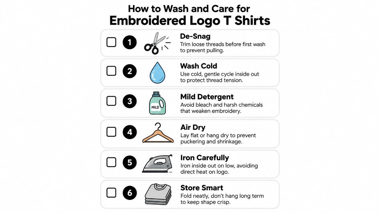
Before the first wash, inspect the logo from both sides. Trim loose backing or stray threads with small scissors, but don't pull anything anchored into the design. A loose thread can catch on another garment and disturb the stitch tension.
A routine that protects the crest
Turn the shirt inside out before washing and use a cold, gentle cycle. A mesh laundry bag adds another layer of protection when the load contains zippers, hooks, or rough hardware. Choose a mild liquid detergent, and skip bleach and oxygen brighteners because harsh chemistry can weaken threads and affect color.
Don't wring the tee. Press out excess water, reshape the shoulders and hem, then lay it flat or use low-tumble drying. Air drying is gentler on the fabric and reduces the chance of heat-related puckering or shrinkage.
For ironing, never place a hot soleplate directly on the embroidered logo. Iron from the inside on low heat, or use a press cloth between the iron and the garment. Direct heat can damage polyester thread and flatten the dimensional surface.
Save this care checklist
- De-snag first: Trim loose threads instead of pulling them.
- Wash cold: Turn the shirt inside out and choose a gentle cycle.
- Use mild liquid: Avoid bleach and aggressive brightening products.
- Dry with restraint: Lay flat or use low tumble, and never wring.
- Iron from inside: Keep direct heat away from the stitched logo.
- Store folded: Long-term hanging can distort the shape of heavyweight cotton.
For a comparable textured layer, the embroidered crewneck sweatshirt guide follows the same basic principle. Protect the thread, support the garment's shape, and spot-clean small marks instead of washing the piece unnecessarily.
Ways to Style Embroidered Logo T Shirts Day to Night
An embroidered tee works best when the rest of the outfit gives the logo room to breathe. The NY Crown Crest doesn't need competing graphics, oversized accessories, or a second statement piece fighting for attention.
The streetwear uniform
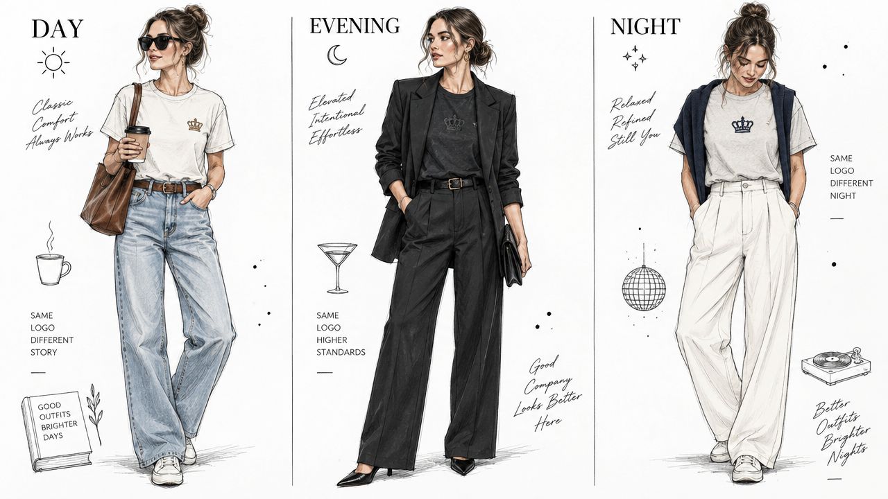
Start with a relaxed-fit embroidered tee in bone with the NY Crown Crest, then build around the warmth of the base color. Pleated cargos add volume without making the outfit look careless. Chunky runners keep the proportions grounded, while a compact crossbody breaks up the torso.
Repeat one logo color in a cap. It doesn't need to match perfectly. A muted gold thread echoed in the cap's embroidery or a small navy detail in the shoe is enough to make the outfit feel deliberate.
Washed denim can replace cargos when you want less utility. Keep the jeans roomy through the leg and let the tee sit naturally rather than forcing a sharp tuck. The embroidered crest should remain visible, but the silhouette should still feel relaxed.
The quiet smart-casual move
A tonal black embroidered tee on washed black cotton can slide into a sharper wardrobe than most graphic tees. Tuck it into wide-leg wool trousers, add an unstructured blazer, and switch runners for loafers. The tonal embroidery gives the outfit texture without breaking the dark palette.
Keep jewelry minimal. One chain, a watch, or a single ring is enough because the stitched chest already provides a point of interest. The NYFW connection makes sense. The look feels considered through proportion, fabric, and restraint rather than obvious branding.
For evening, change the footwear first. A clean loafer or low-profile leather sneaker immediately shifts the outfit. Add a lightweight overshirt or blazer and leave the tee's neckline open enough to keep the layers from feeling compressed.
The family crest approach
Matching doesn't need to mean identical outfits. Put an adult in an oversized embroidered tee with shorts, then dress children in mini versions with joggers. Keep everyone in the same colorway so the crest reads as a shared identity rather than a costume.
A classic navy crest on oat works especially well for family photos because the contrast is clear without looking loud. Parents can add denim or shorts, while children get softer jogger proportions and practical sneakers. The same emblem creates visual continuity across ages.
DM-FlexWear's size range supports this kind of coordinated wardrobe, from infant garments through adult unisex sizing. A published unisex clothing size chart illustrates how adult ranges can span from XS through 3XL with broad chest-based measurements, making shared styling easier without relying on separate men's and women's cuts.
The day-to-night formula
Use this simple switch:
- Day: Relaxed tee, utility trousers or shorts, runners, and a cap.
- Transition: Remove the cap, add an overshirt or unstructured blazer, and sharpen the accessories.
- Night: Replace runners with loafers or a clean low-profile sneaker, then keep the embroidered chest visible.
Why Smaller Tonal Embroidery Is the New Premium Signal
The loudest logo isn't automatically the most luxurious one. In current streetwear, a large chest graphic can communicate reach, but a smaller tonal crest often communicates judgment. The wearer is showing that they understand proportion, fabric, and context.
A 2-inch crown crest in matching oxblood thread on heavyweight oxblood cotton has a different cultural charge from a chest-spanning graphic. The low contrast forces the eye closer. You see the stitch direction, the edge control, and the way the thread catches light without turning glossy. That proximity makes workmanship part of the message.
Restraint makes flaws visible
Tonal embroidery gives the logo less visual noise to hide behind. If the crown is poorly digitized, the uneven spacing stands out. If the satin borders are too dense, the design looks swollen. A smaller mark also limits the stitch count, which can improve comfort and keep the chest from feeling overworked.
For buyers choosing a crest tee, ask about practical details rather than only color. A compact design using 40-weight thread can preserve readable lines while keeping the surface controlled. Designs with fewer than 800 stitches can be appropriate for a minimal chest hit, provided the artwork has been simplified for thread and the fabric supports the construction.
The premium test: If the logo still looks intentional when the contrast drops, the garment has a stronger foundation than color alone.
NY Crown Crest colorways show how the idea works across different moods:
- Bone on black: High contrast, but still more refined than a large graphic because the mark stays contained.
- Navy on navy: Almost hidden at first glance, with texture doing the visual work.
- Cream on oatmeal: Soft contrast that fits tonal layering and understated family matching.
Placement matters too. A sleeve or hem hit can act like a camera detail, the small element that appears when the wearer moves or a photo catches the side profile. These placements use less visual space, so sloppy stitching becomes obvious. The reward is a logo that feels discovered rather than announced.
The broader embroidered apparel market reflects why this category matters commercially. A 2025 estimate valued the global embroidered apparel market at $5.8 billion, with T-shirts representing 28.5%, or about $1.653 billion, as its largest product segment, according to this embroidered apparel market estimate. The same estimate projects the market to reach $8.7 billion by 2034, with a projected 5.2% CAGR, while the T-shirt segment is projected to grow at 4.8% annually through 2034. These figures don't mean every tee needs embroidery. They show that a mainstream basic and a durable, tactile decoration method occupy a meaningful space together.
A tonal tee also survives more situations. It can pass through a relaxed office dress code, work under a jacket, and coordinate with family photos without dominating them. That versatility is the upgrade. The shirt earns repeat wear because the logo signals identity, while the heavyweight construction gives the look enough presence to stand on its own.
DM-FlexWear.com offers NY Crown Crest heavyweight unisex tees alongside embroidered hoodies, crewneck sweatshirts, and baby crewneck tees in coordinated colorways and sizes. Visit DM-Flexwear.com to find a restrained embroidered logo tee for your everyday rotation, or build a matching crest look across the family.