

Comfort Color T-shirts with pocket are heavyweight, ring-spun cotton tees known for their vintage washed look and durable construction, ideal for layering in streetwear looks. The classic version uses 6.1 oz/yd² fabric and 100% ring-spun U.S. cotton, giving a pocket tee enough presence to anchor an outfit without becoming stiff.
You know the moment. You're dressed in loose denim, clean sneakers, maybe a cropped jacket, and the lightweight tee underneath looks like an afterthought. A garment-dyed pocket tee fixes that immediately. It brings texture, structure, and a lived-in color story that works on a Brooklyn block just as easily as it does outside a fashion-week venue.
Table of Contents
- Why The Pocket Tee Is Your New Uniform
- Understanding Fabric And Construction Quality
- Finding Your Perfect Fit And Size Guide
- Styling Pocket Tees For Modern Streetwear
- Care Instructions That Preserve Quality
- Making The Investment Decision
Why The Pocket Tee Is Your New Uniform
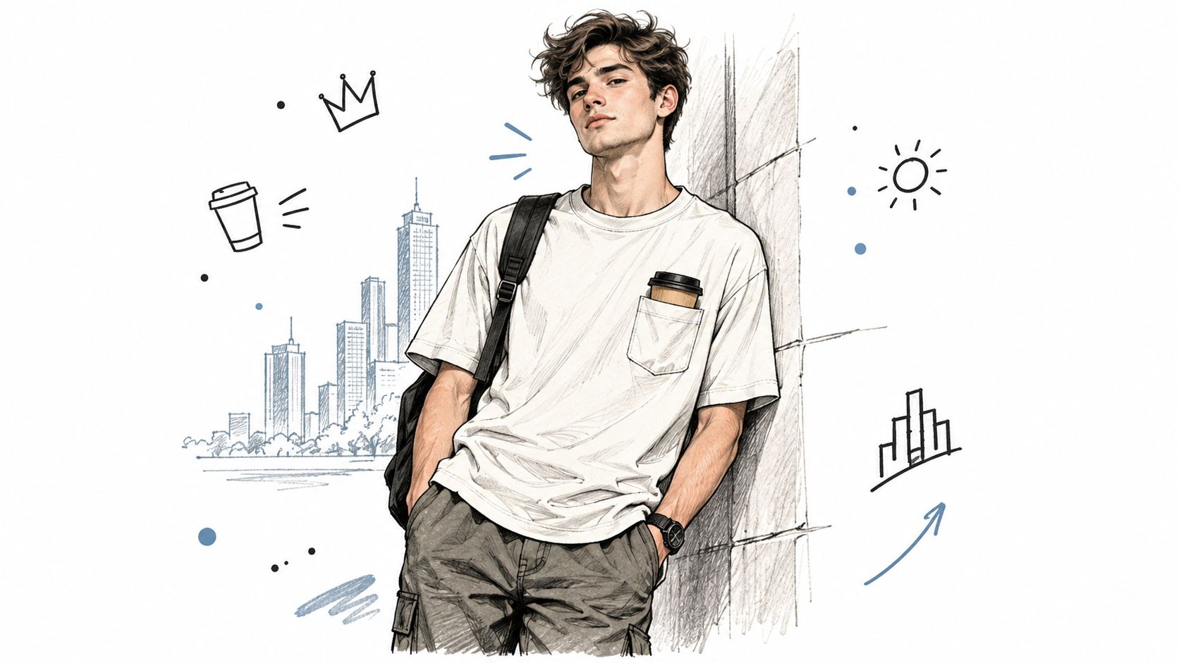
On a busy New York morning, the best outfits rarely look over-engineered. A heavyweight pocket tee under an open overshirt, relaxed trousers, and worn-in sneakers does the job because every piece has a clear role. The pocket adds visual balance across the chest, while the washed finish keeps the garment from looking too polished or generic.
The appeal of Comfort Colors pocket T-shirts starts with their unusual origin story. In 1975, Barry T. Chouinard began experimenting with garment dyeing in rural Vermont, reportedly starting with approximately $275 in capital and a household washing machine. The operation grew from a small dyeing business into T-shirt production as demand increased for colorful casual apparel. Gildan Brands Australia's history of Comfort Colors provides useful background on that evolution.
By the 1980s, the company had developed garment-dyed, ring-spun cotton T-shirts. That construction sequence matters. The garment is sewn first and dyed afterward, so the color settles across the finished shape and contributes to the soft, broken-in appearance associated with the brand. The pocket tee doesn't just look vintage because someone selected a faded shade. Its character comes from the way the garment was finished.
From Vermont dye house to streetwear staple
Comfort Colors formally adopted its name in 1995, a milestone that marked its shift from a small dyeing enterprise to a recognizable apparel label. The product category stayed rooted in casual use, not technical performance. Its value comes from tactile comfort, relaxed proportions, washed color, and everyday versatility.
That distinction explains why a pocket tee works so well in modern streetwear. It doesn't chase a seasonal silhouette. It provides a dependable base for a crest, a cropped bomber, a long coat, or a simple chain. In a collection such as DM-FlexWear's NY Crown Crest line, the heritage blank gives a New York-inspired motif enough room to feel intentional rather than pasted onto a thin promotional shirt.
Practical rule: Treat the pocket tee as the foundation of the outfit, not the leftover layer beneath it.
The shirt also travels well stylistically. Wear it loose with cargos for a downtown uniform, tuck it partially into pleated trousers for a sharper proportion, or let it sit beneath a hoodie when the temperature drops. Its permanent place in the rotation comes from that range. The pocket is functional, but it also breaks up a broad chest panel and gives a plain tee a recognizable point of view.
Understanding Fabric And Construction Quality
A comfort-color pocket tee earns its weight through more than a heavy fabric number. The official specification for the heavyweight style lists 6.1 oz/yd² fabric and 100% ring-spun U.S. cotton, with adult sizes S, M, L, XL, 2XL, and 3XL, plus 56 total color options, made up of 44 pigment-dyed colors and 12 direct/reactive colors. The product specification from Printify shows why the category offers more styling flexibility than a standard lightweight blank.
Ring-spun cotton gives the fabric a smoother hand, while the heavier jersey adds opacity and helps the pocket hold its shape. That doesn't mean weight alone guarantees quality. Cotton single-jersey comparisons across approximately 160, 180, 200, and 220 g/m² found that fabric weight had little effect on color fastness, while dimensional behavior varied more meaningfully. The textile performance assessment is a useful technical reference when evaluating fabric beyond marketing language.
| Specification | Quality Indicator | Why It Matters |
|---|---|---|
| Fabric weight | Substantial midweight or heavyweight jersey | Improves opacity, drape, and pocket stability |
| Fiber | 100% ring-spun cotton | Creates a smoother, softer hand than a rough basic cotton |
| Dye process | Garment dyed after construction | Produces washed character and slight shade variation |
| Pocket construction | Stable opening edges and reinforced upper corners | Reduces stretching and pocket-mouth distortion |
| Measurements | Published weight, composition, and shrinkage tolerance | Helps buyers compare garments realistically |
Read the pocket, not just the body
A good pocket tee needs alignment between the body and pocket. The pocket should follow the body's grain direction, with a stabilized opening and reinforcement at the upper corners. If the opening stretches after a few wears, the shirt can look tired even when the main body remains in excellent condition.
Garment dyeing also deserves precise language. It isn't a synonym for softness. The finished shirt is dyed after construction, which creates a broken-in appearance and can produce minor shade variation between garments and after washing. For a closer look at the related heavyweight blank category, Raccoon Transfers' guide to the Comfort Colors 1717 offers useful product context.
Before buying or decorating a pocket tee, check the full specification rather than stopping at GSM. The most useful details are fabric weight, fiber composition, shrinkage tolerance, pocket composition, and post-wash measurements. For a broader material comparison, DM-FlexWear's guide to the best fabrics for T-shirts is a practical starting point.
Finding Your Perfect Fit And Size Guide
The relaxed shape is part of the appeal, but it creates a sizing trap. Customer feedback on Comfort Colors pocket styles is mixed. Some buyers report accurate sizing, while others mention a snug neckline, a longer torso, oversized dimensions, or differences between colors and production batches. One retailer's review data shows a 4.9/5 rating and 98% recommendation rate, yet the same listing still contains separate fit and shrinkage feedback, which means high satisfaction doesn't eliminate uncertainty. The Comfort Colors 6030 listing illustrates why “true to size” is too blunt on its own.
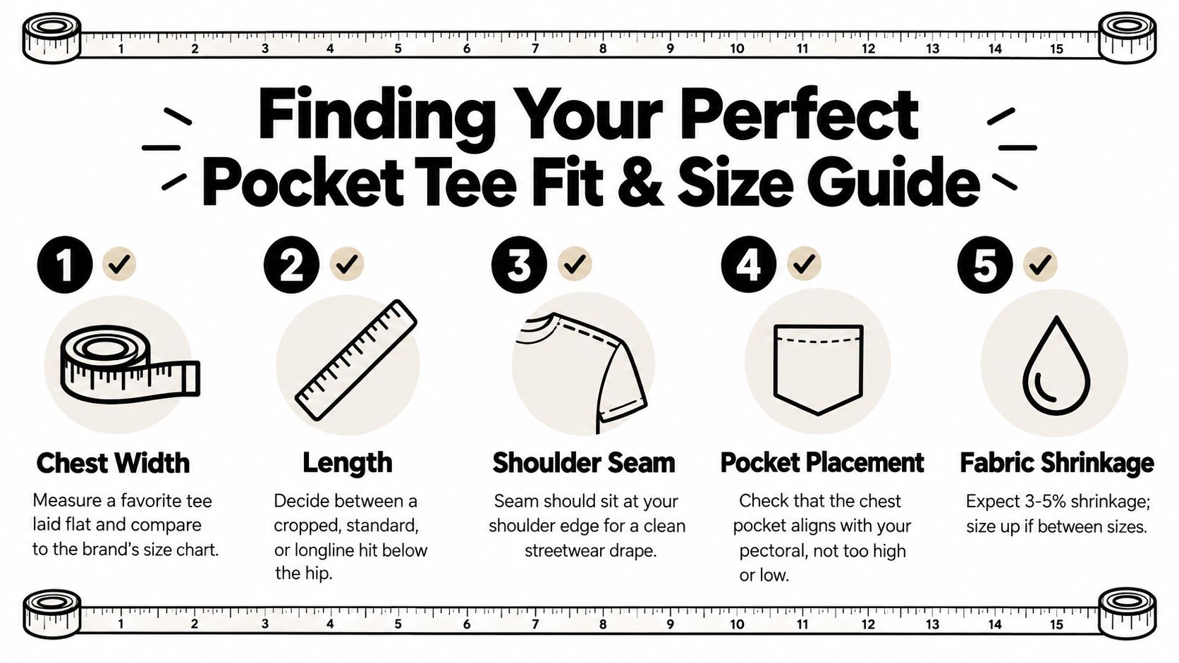
Measure a shirt you already like instead of relying only on your usual letter size. Lay it flat, measure across the chest from armpit to armpit, measure from the highest shoulder point to the hem, and note the sleeve and shoulder position. Compare those measurements with the seller's garment chart, not just a body-size chart. For more context on relaxed unisex silhouettes, see DM-FlexWear's guide to unisex tees.
Choose by proportion and purpose
Use the following framework when two sizes both seem plausible:
- Choose your normal size if you want the intended relaxed width and enough room for daily movement.
- Size down if you prefer cleaner lines, narrower layering, or a less oversized streetwear profile. Check the torso length first, because a smaller size may reduce width without solving a neckline preference.
- Size up when the tee will sit over a hoodie, crewneck, or long-sleeve base layer. The added room should support layering, not create an uncontrolled drop shoulder.
- Prioritize length if you have a shorter torso or prefer a cropped visual line. A wide shirt can look stylishly boxy, but excessive length can overwhelm tapered trousers.
- Inspect pocket placement on your body. The pocket should sit across the pectoral area, not near the collarbone or down toward the ribs.
A pocket tee can look intentionally oversized and still fit correctly. Judge the shoulder seam, chest width, hem position, and pocket height together. Batch variation is another reason to compare actual garment measurements when available, especially if you're ordering multiple colors.
Styling Pocket Tees For Modern Streetwear
The strongest colorway depends on the role you want the tee to play. Black and navy create a darker downtown base, white and grey keep the outfit clean, and gold provides a sharper accent for a crest-led look. The NY Crown Crest palette of Gold, Black, White, Grey, and Navy makes color-blocking straightforward without forcing loud combinations.
Start with the simplest formula: a white or grey pocket tee, dark relaxed denim, and low-profile sneakers. The contrast keeps the pocket visible and gives a graphic crest room to read. For a more tonal outfit, pair a navy tee with charcoal trousers and black footwear. The result feels quieter, but the heavyweight fabric keeps the silhouette from collapsing into basics territory.
Build the outfit around the pocket
The pocket creates a natural focal point, so avoid adding competing detail directly above it. A short chain, compact crossbody strap, or open overshirt can frame the chest without hiding the pocket entirely. Heavy outerwear works because the tee's structure prevents the base layer from disappearing.
Try these combinations:
- NYC neutral: Grey tee, black cargos, black sneakers, and a cropped nylon jacket.
- Crest contrast: Gold tee, dark blue denim, white sneakers, and a navy overshirt.
- Clean monochrome: White tee, ecru trousers, grey accessories, and minimalist leather footwear.
- Cold-weather base: Black tee under a grey crewneck, with a long coat and relaxed trousers.
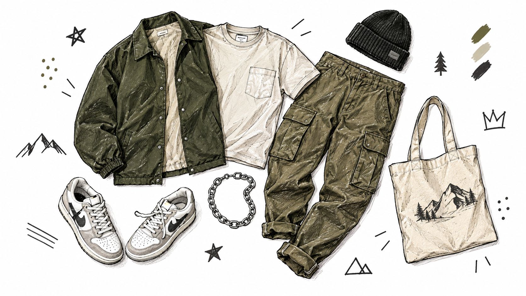
- Workwear edge: Navy tee, olive jacket, carpenter pants, and sturdy canvas sneakers.
The key comparison is between a standalone tee and a layering tee. A standalone shirt needs enough color and structure to carry the outfit by itself. A base layer should sit comfortably under the next garment, with the pocket either visible as a deliberate detail or covered completely. Half-hidden pockets often look accidental.
Fashion-week energy comes from proportion and restraint, not from piling on logos. Let one item carry the statement, then keep the rest of the outfit disciplined. A crest tee with wide trousers and a sharp jacket feels considered. The same tee with several competing graphics, oversized accessories, and busy footwear loses the New York clarity.
A pocket tee also changes character with footwear. Retro runners push it toward athletic streetwear, leather sneakers clean it up, and work boots emphasize the garment-dyed heritage. The fabric provides the common thread, so the rest of the outfit can move between downtown casual and a more polished NYFW-adjacent look.
Here's a visual reference for combining relaxed layers, utilitarian pieces, and everyday accessories:
Care Instructions That Preserve Quality
Garment-dyed cotton looks best when you treat its variation as part of the design. Each piece can develop a slightly different shade, and washing may deepen the lived-in character. The wrong care routine won't create a better vintage finish. It can cause premature fading, distortion, or color transfer.
Dark shades deserve more attention because black and navy often contain a higher apparent dye load, making fading and crocking easier to notice. Reactive dyes bond to cellulose fibers through covalent bonds, which generally supports stronger wash durability than loose surface coloration. Testing commonly considers wash, rubbing, light, and perspiration fastness under ISO 105 or AATCC methods. A practical commercial benchmark is a grey-scale rating around 4 or higher for wash color change and staining, although the appropriate requirement depends on the product and market. The textile color-fastness research explains why both fading and transfer matter.
A low-stress wash routine
Follow the garment's specification sheet first. A published care specification recommends washing inside out at a maximum of 30°C, using like colors, oxygen or non-chlorine bleach only, tumble-drying at no more than 60°C, and avoiding ironing and dry-cleaning. The garment-dye care guidance gives the clearest mechanical rules for preserving the finish.
For everyday wear, use cool water and mild detergent. Turn the tee inside out before washing, especially when a crest or other decoration sits near the pocket. Skip chlorine bleach, avoid high heat, and air-dry when practical. If you tumble-dry, choose a low setting and remove the shirt while it's still slightly relaxed rather than baking it dry.
Color-care rule: Wash dark pocket tees with similar shades and test a hidden area if you're concerned about transfer onto lighter garments.
Don't treat minor shade variation as a defect. It's part of post-construction dyeing and helps separate the shirt from a uniform, factory-flat basic. Store folded or on a broad hanger, keep the pocket empty, and avoid cramming heavy objects into it for long periods. For graphic or decorated alternatives that need similar handling, DM-FlexWear's graphic tee guide offers useful wardrobe-care context.
Making The Investment Decision
A quality pocket tee is worth prioritizing when you'll wear it as a foundation rather than a novelty. The value comes from the combination of heavyweight cotton, ring-spun softness, garment-dyed texture, relaxed fit, and styling range. A cheaper lightweight tee may cost less initially, but it often asks more from the rest of the outfit because it contributes less shape and visual weight.
Comfort Colors reached approximately $8.9 million in annual sales in 1989, about $27.8 million by 2005, and roughly $95 million by 2014. On March 2, 2015, Gildan acquired the brand for $100 million in cash. The Comfort Colors commercial history places the modern blank-apparel line in context. It began as a Vermont dyeing operation and developed into a recognizable brand with industrial-scale production.
Who benefits most from the upgrade
The streetwear enthusiast gets a stable canvas for crest embroidery, graphics, outerwear, and wide-leg proportions. The minimalist gets a small rotation of color-rich staples that don't look identical even when the silhouettes match. The fashion-conscious shopper gets a casual garment with enough density and texture to support more dressed-up styling.
The trade-off is clear. A heavyweight cotton tee can feel warmer than a lightweight basic, and the relaxed cut may not suit someone who wants a close, athletic fit. Garment dyeing can also produce shade variation, so shoppers who demand perfectly uniform color across several pieces may prefer a more standardized finish. Buyers should read care instructions and verify measurements before ordering.
The best way to judge the investment is by outfit mileage. Can the shirt work with denim, cargos, fitted trousers, a hoodie, and a structured jacket? Can it move from summer standalone wear to winter layering? If yes, the cost-per-wear logic becomes stronger, even without assigning a precise dollar figure.
Presentation matters when you're comparing garments online. Product photography should show the pocket height, shoulder seam, hem length, fabric texture, and color under consistent lighting. A practical guide for clothing photos can help shoppers and apparel teams understand why accurate visual merchandising makes fit and color decisions easier.
A pocket tee won't replace every basic in your drawer. It should replace the basics you keep skipping because they look flat, feel flimsy, or fail under layers. Prioritize one dark color, one light neutral, and a statement shade if your wardrobe supports it. That mix gives the garment-dyed texture room to work across the week.
DM-Flexwear.com offers the NY Crown Crest Heavyweight Unisex Tee in Gold, Black, White, Grey, and Navy, alongside coordinated hoodies and crewneck sweatshirts in adult sizes from S through 3XL. Visit DM-Flexwear.com to build a New York-inspired pocket-tee rotation around substantial everyday layers, crest details, and colors that work from streetwear basics to fashion-week-ready outfits.